Steam Redesign
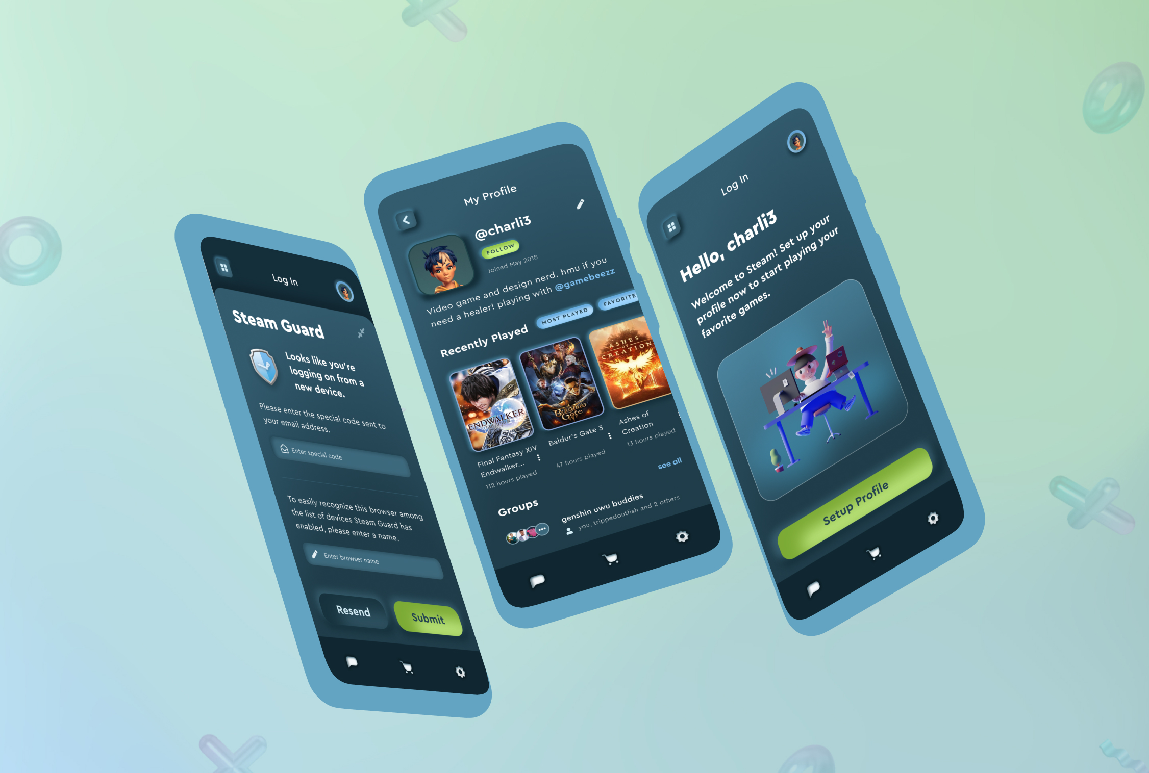
Design Problem
App Redesign: pick an app or digital product with significant flaws in the visual design, look and feel, and UI. Document those flaws, brainstorm alternative solutions, and redesign the application. Focus on visuals and address UX issues secondarily.
Project Overview
- Course: SI 616: Advanced Visual Design
- Duration: Nov 2021 - Dec 2021
- Discipline: Visual Design, UI Design, UX Research & Design
- Tools Used: Figma, Illustrator, Photoshop
Motivation
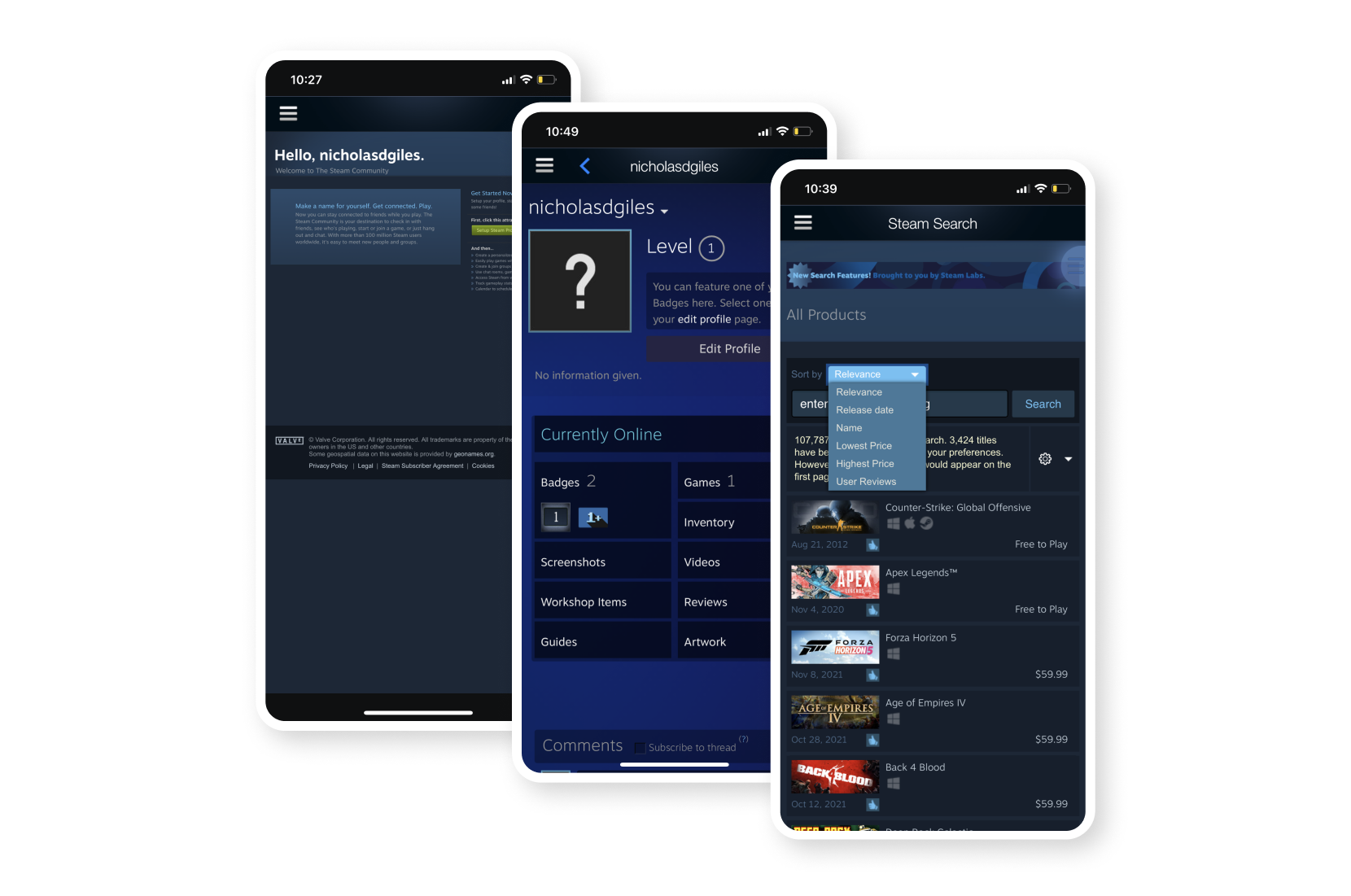
For this project, I decided to redesign the Steam iOS application, which is a digital product that is in need of a UX/UI overhaul. Additionally, I’ve used Steam in the past to play games so I am familiar with many of the application’s UI and UX issues. From doing a quick assessment, I found that the application has significant UX flaws and utilizes outdated design patterns. In order to further dig into these issues, I decided to conduct a heuristic analysis.
Heuristic Analysis
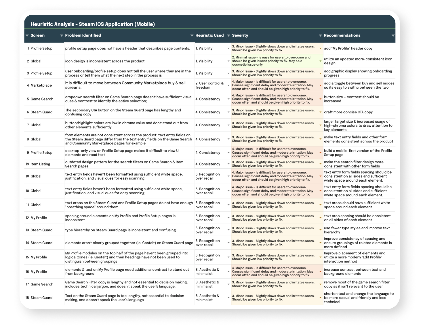
A heuristic analysis was conducted in order to uncover UX and UI issues of the Steam iOS application. The features that were analyzed include Profile Setup, Game Search, Game Listings, Item Listings, and Community Marketplace just to name a few.
I began by creating a checklist of the heuristics that should be applied, as well as crafting the individual criteria for each heuristic. Then I documented issues related to Nielsen Norman’s ten usability heuristics. The heuristics that had the most issues are included below.
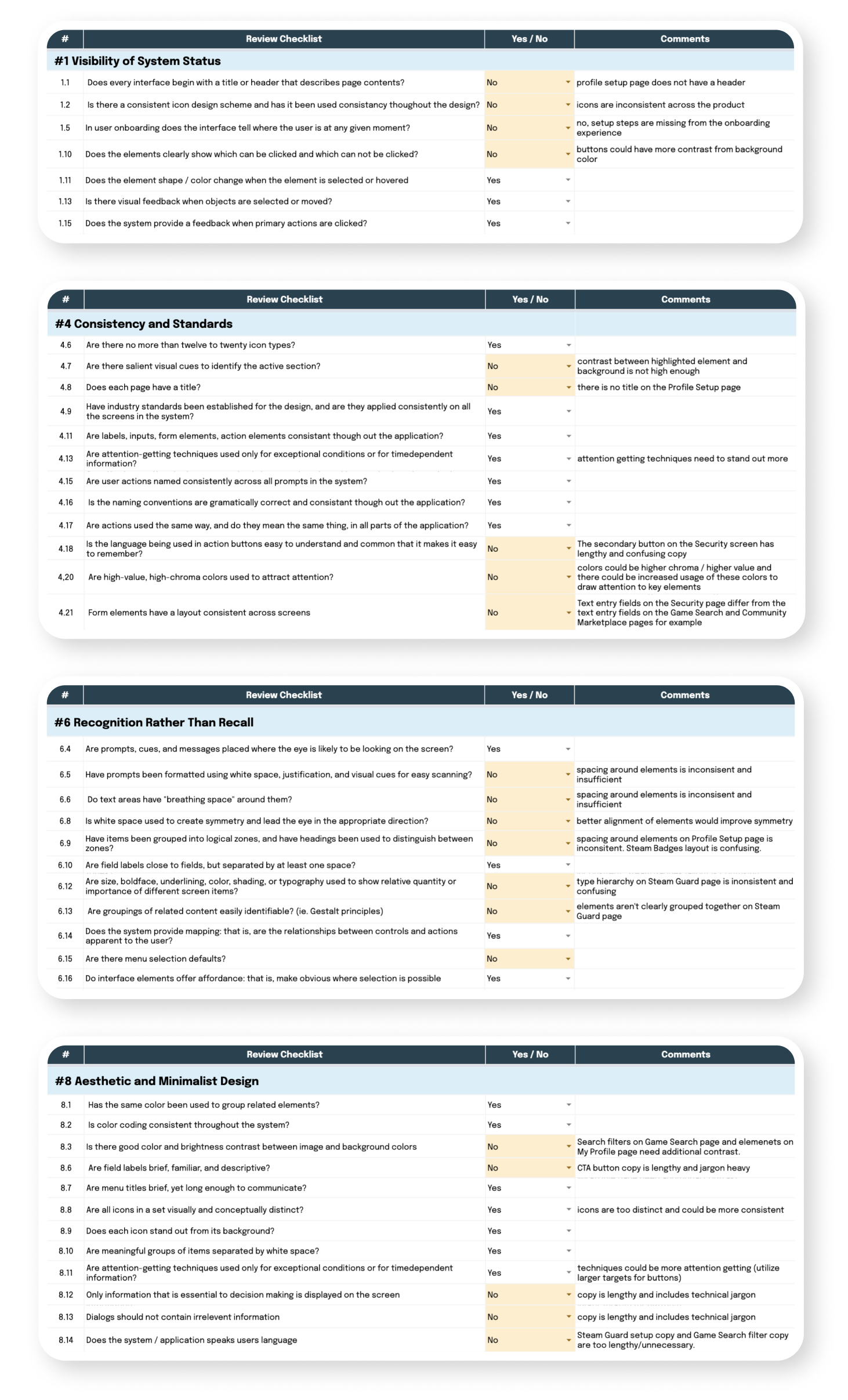
Once I finished creating the heuristic analysis checklist, I rated the severity of each issue and brainstormed solutions. This helped create a list of recommendations for the redesign, and a priority ranking for each task.
Personas
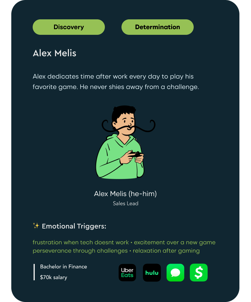
Two personas were designed to represent key users for a redesigned Steam mobile application. I included contrasting behavioral characteristics for both of the personas in order to ensure different users’ needs would be addressed. The personas include information on users’ favorite apps, which helps with understanding mental models and familiar design patterns. The first persona, Alex, focuses on Steam users who have limited income, but ample amount of time to play games with others online.
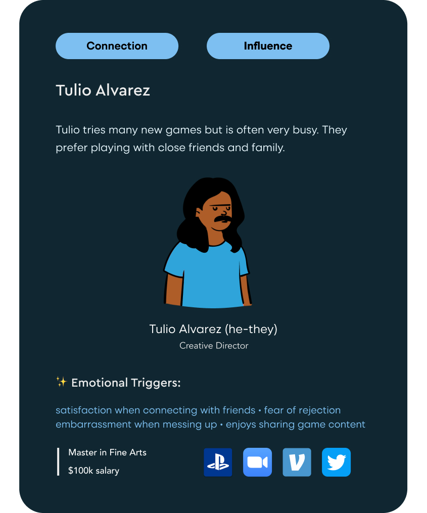
In contrast, the second persona, Tulio, focuses on users who have disposable income, limited time to play, and enjoy gaming with close friends and family.
Site Map
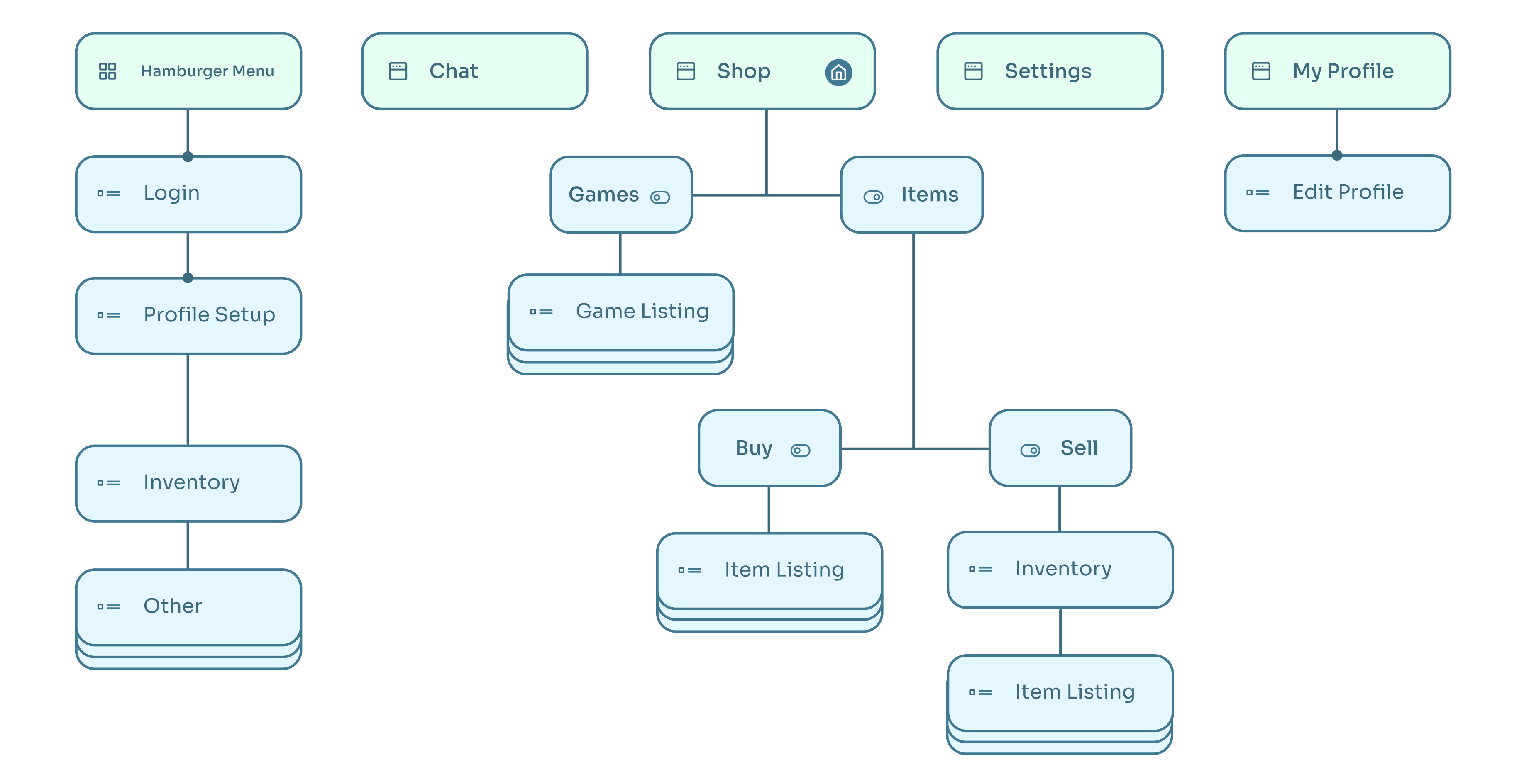
In order to prioritize a selection of core features and screens to redesign, I created a sitemap to document information architecture including page and component hierarchy. I decided to focus on the game store and community marketplace for this redesign as these are key areas for improvement in the current Steam application. Future work would involve building out the sitemap to include additional experiences such as chat and other social features.
Style Guide
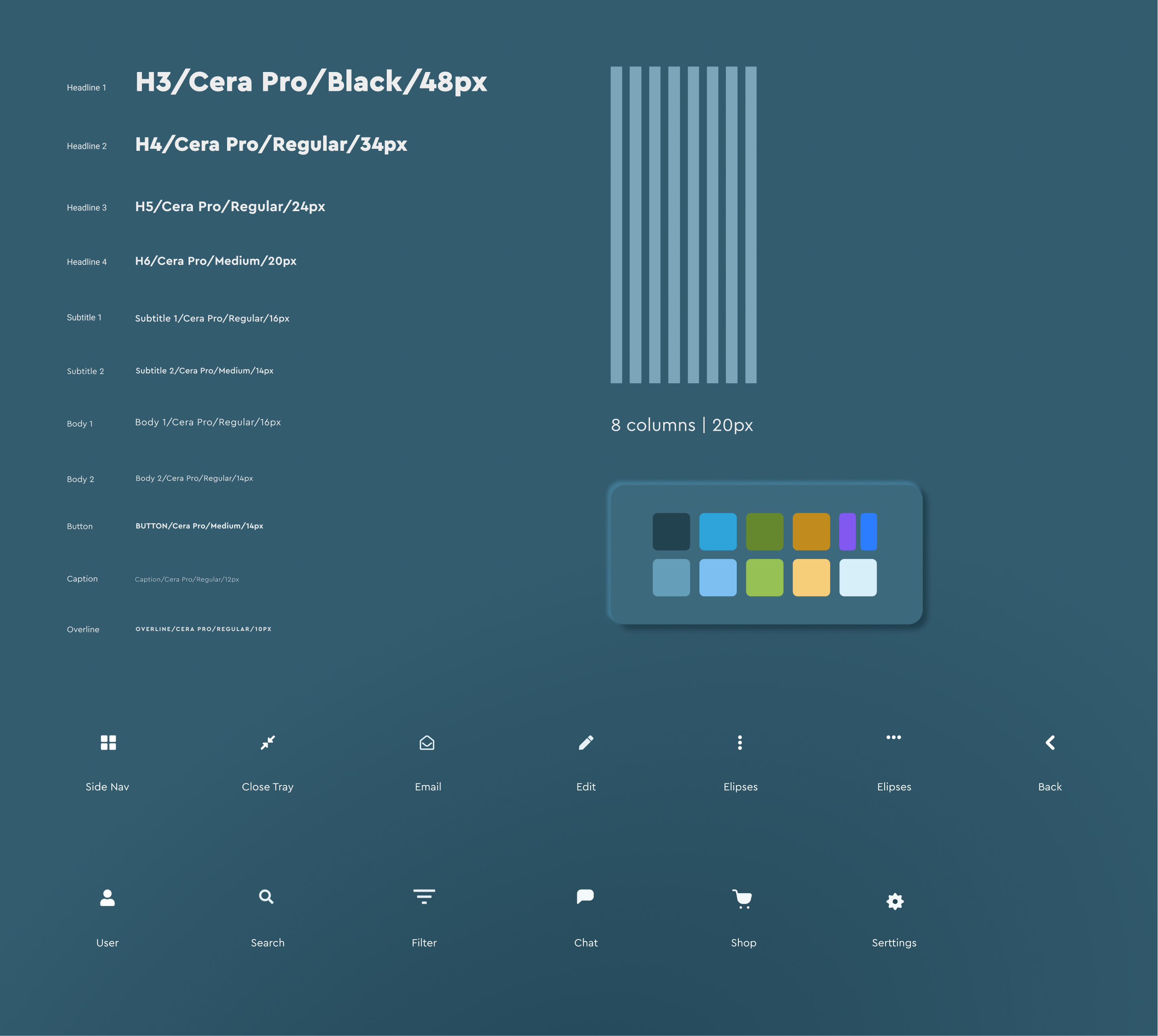
The design system was created with both of the personas in mind. It utilizes the existing Steam color scheme with an updated selection, including a heavier use of secondary colors. I used eight 20px columns for the mobile grid to ensure spacing is consistent across screens. Cera Pro was the font family that I selected for this redesign, as it is clean, modern and easily readable in dark mode. I utilized icons from the SF Symbols library to ensure iconography is consistent and works well with the operating system’s UI elements.
Wireframes
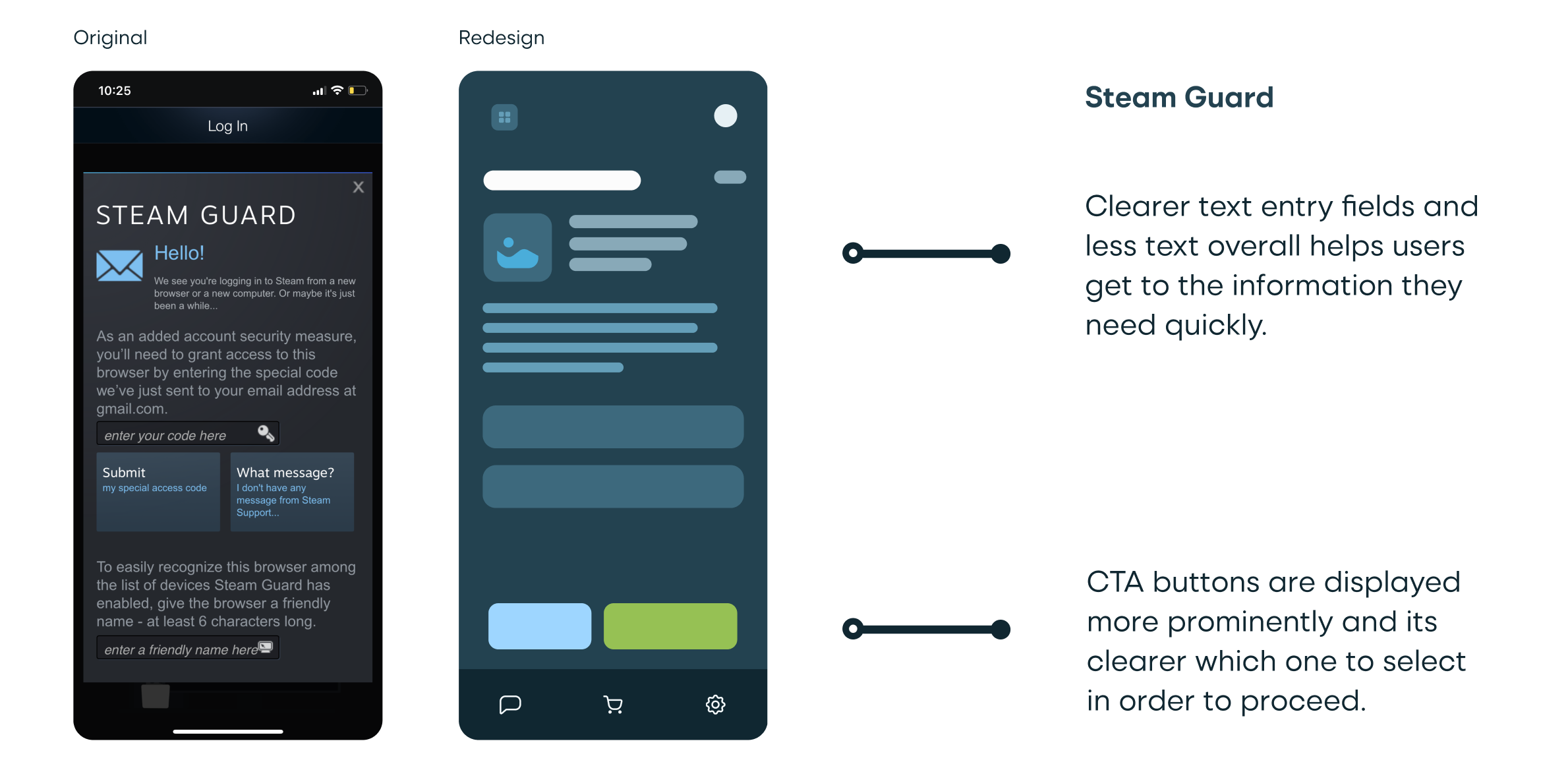
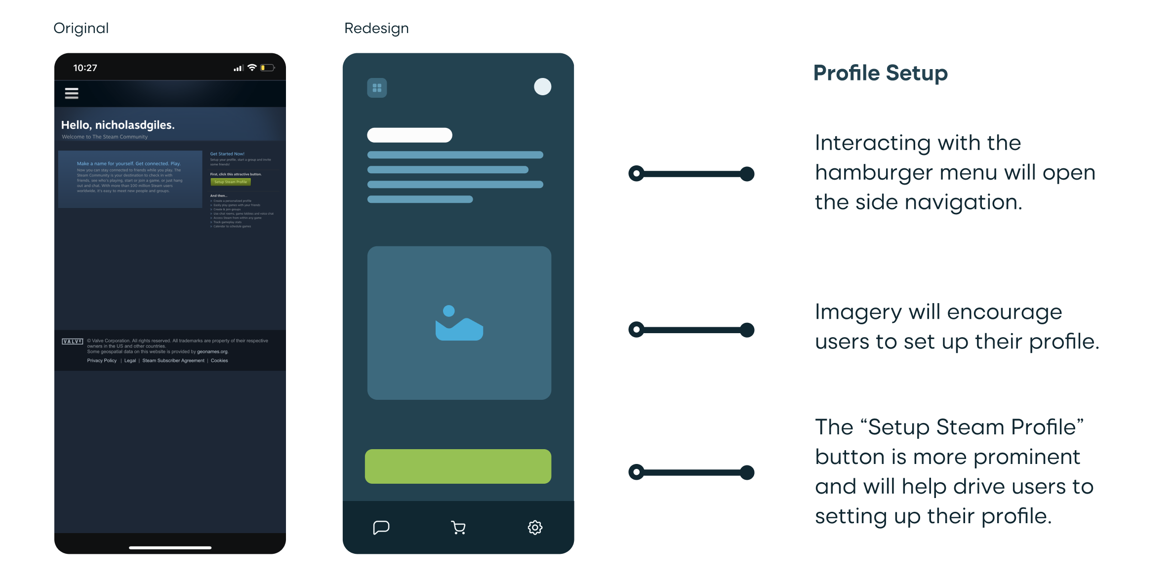
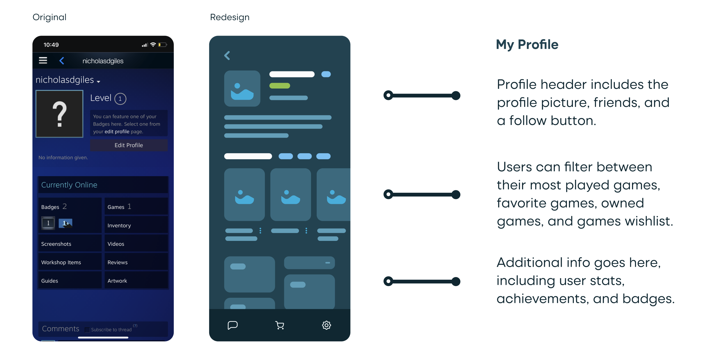
Referencing the heuristic analysis issues and recommendations, I created updated wireframes with UX and UI improvements implemented. Ultimately, I designed eight wireframes that cover a majority of Steam’s core features.
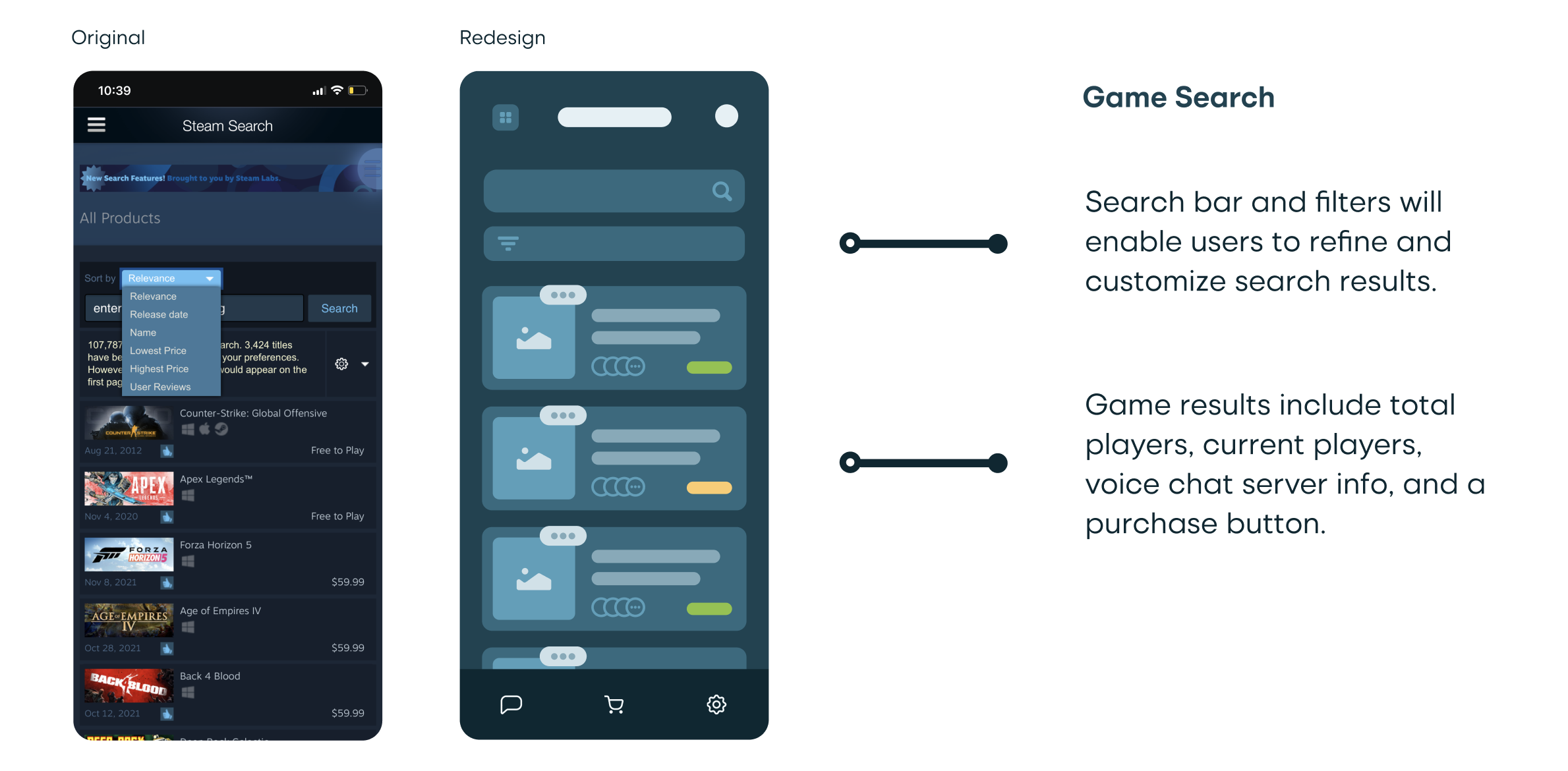
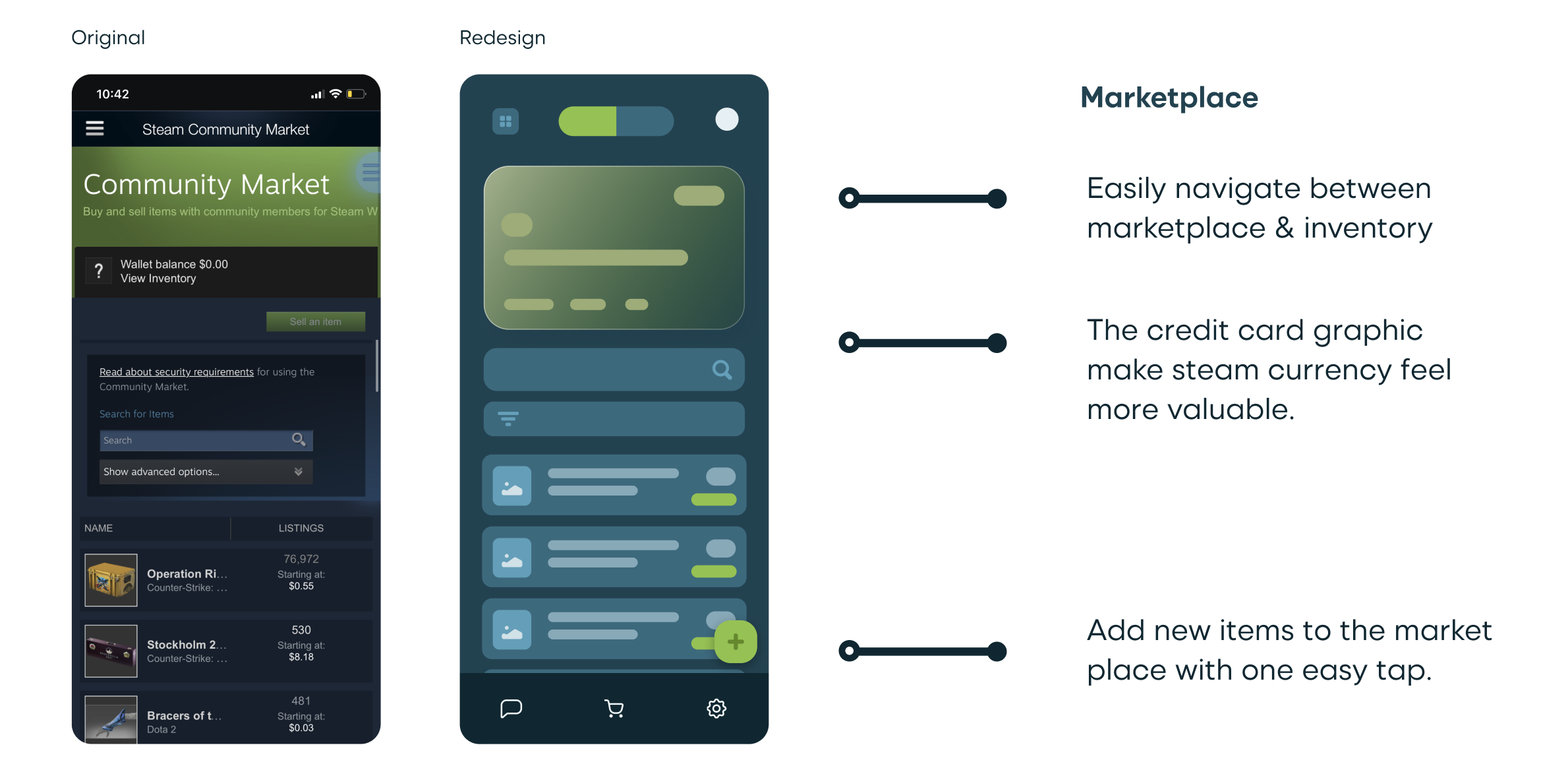
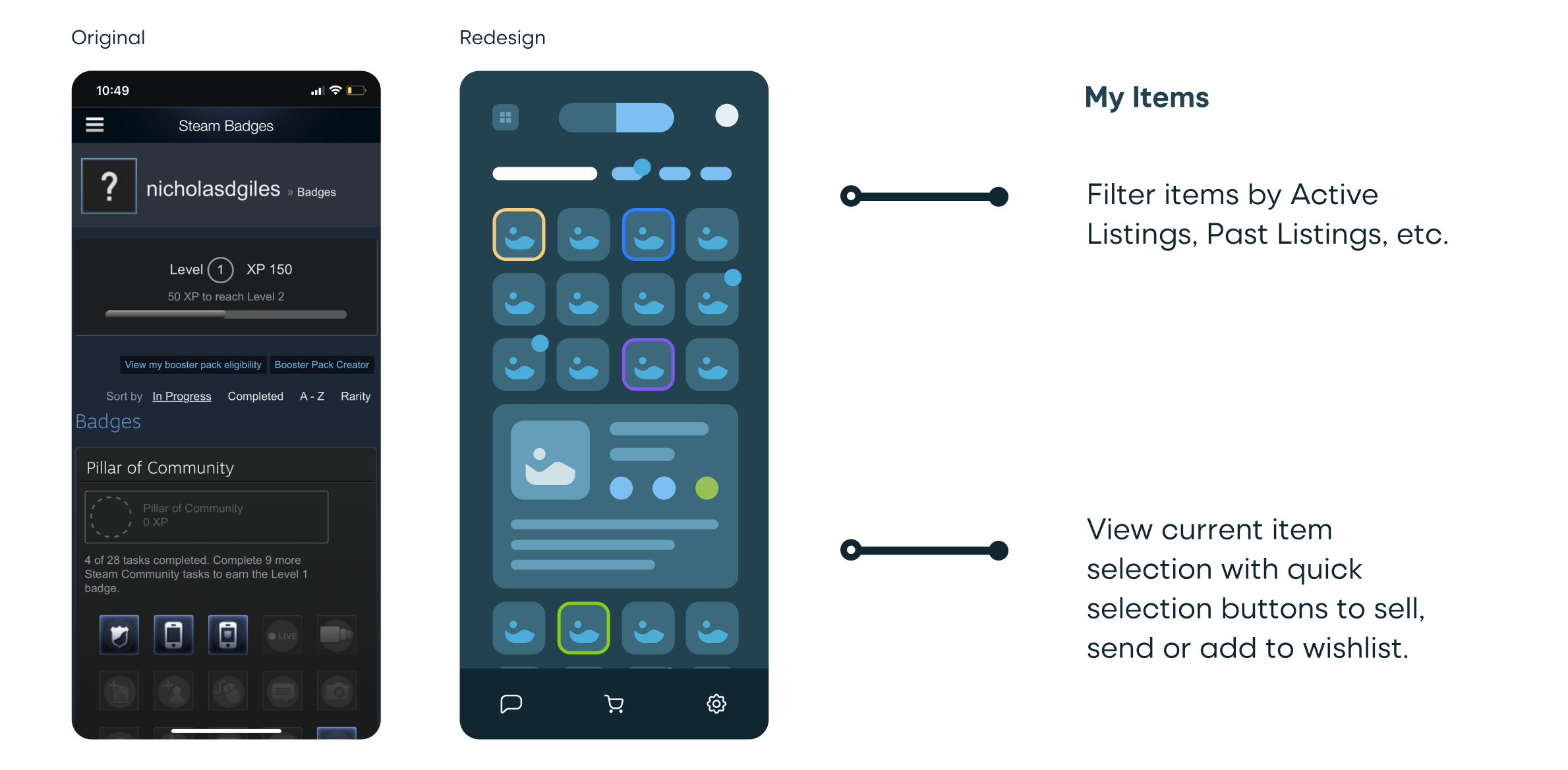
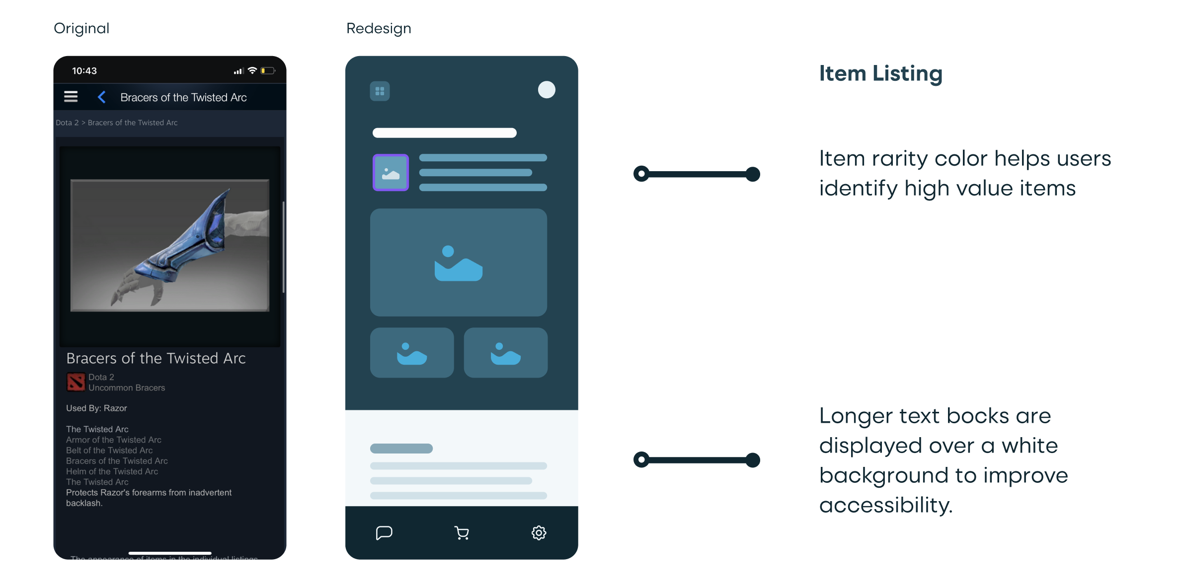
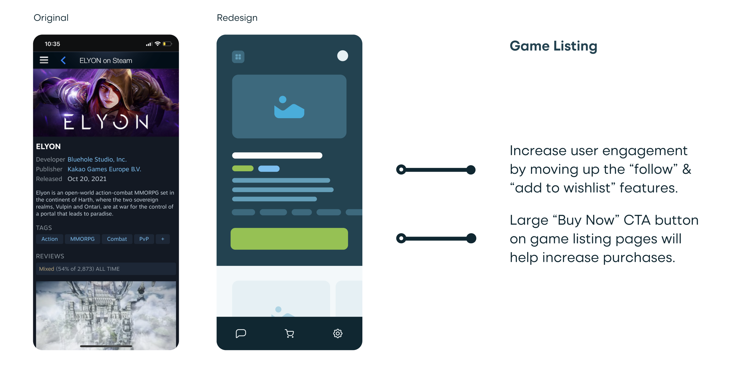
Design Components
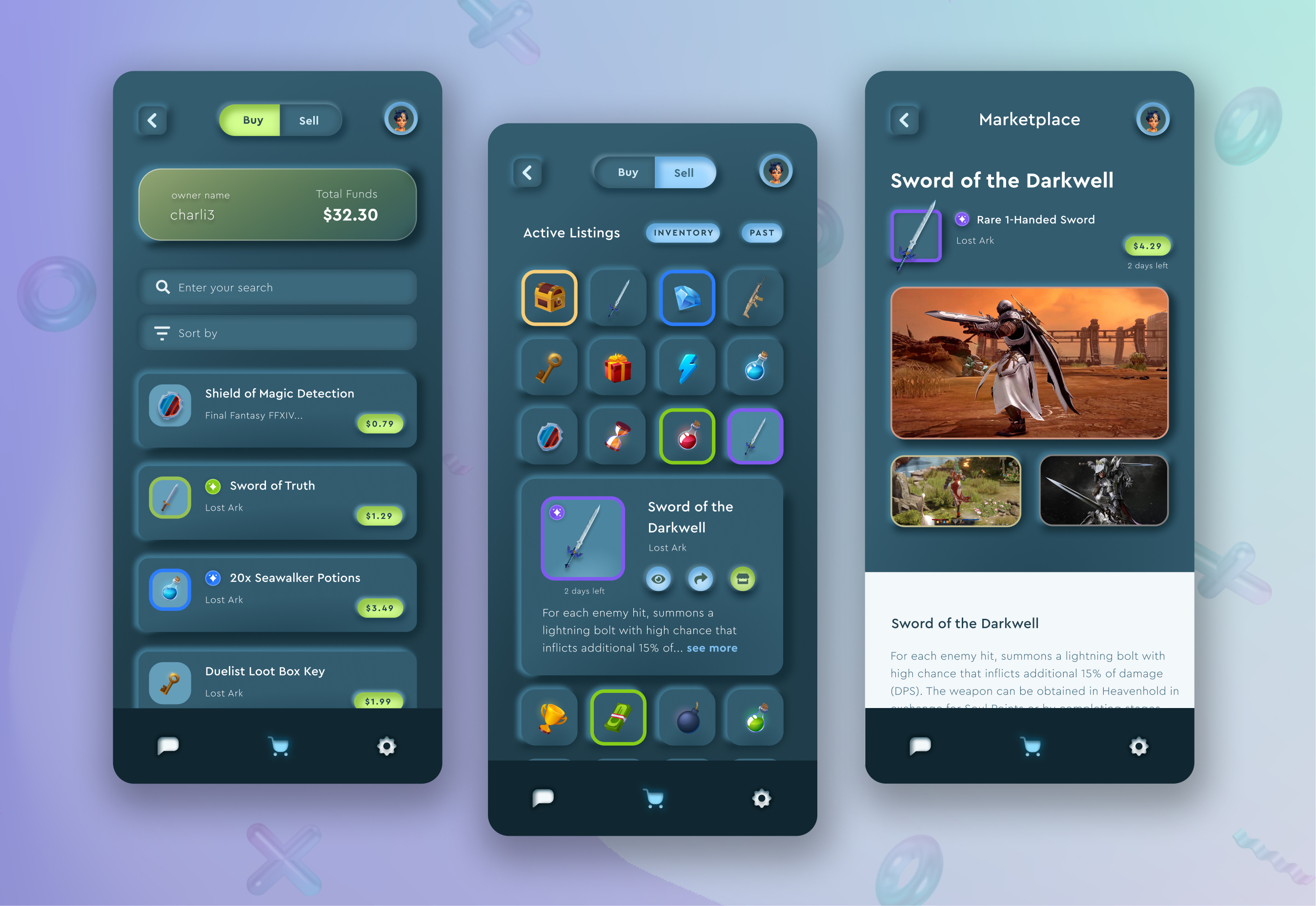
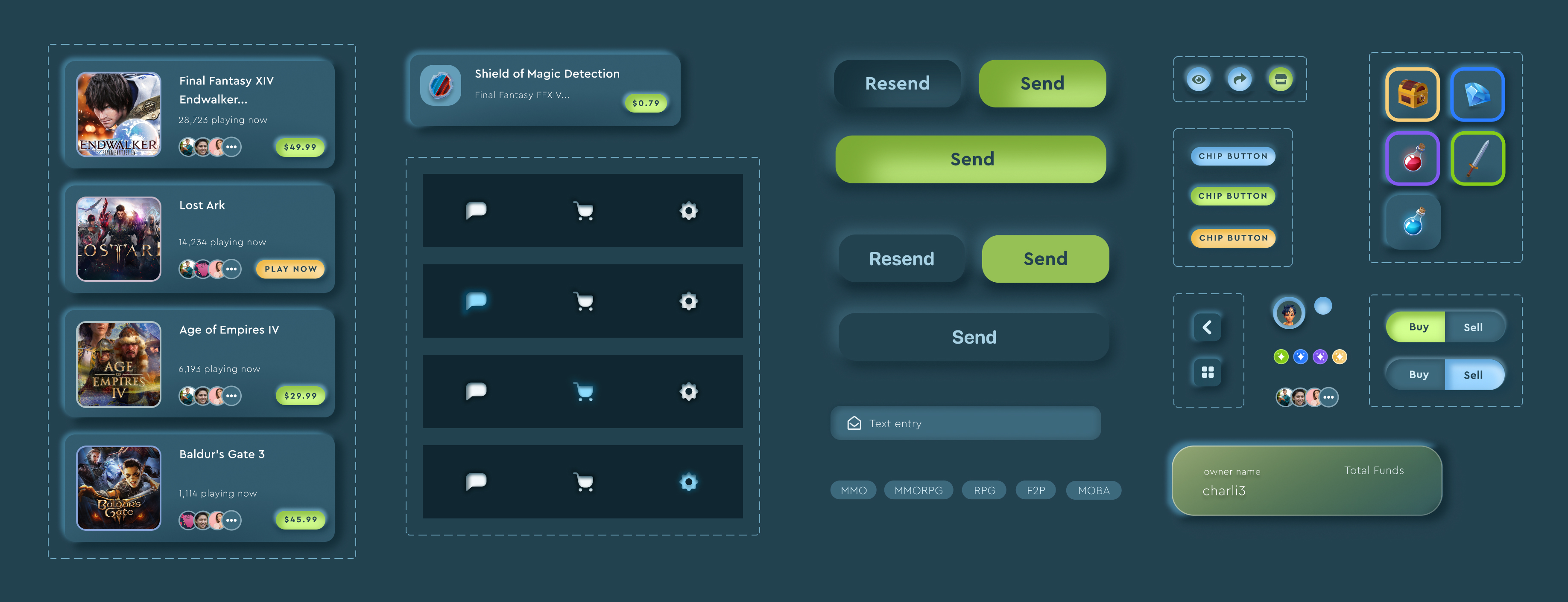
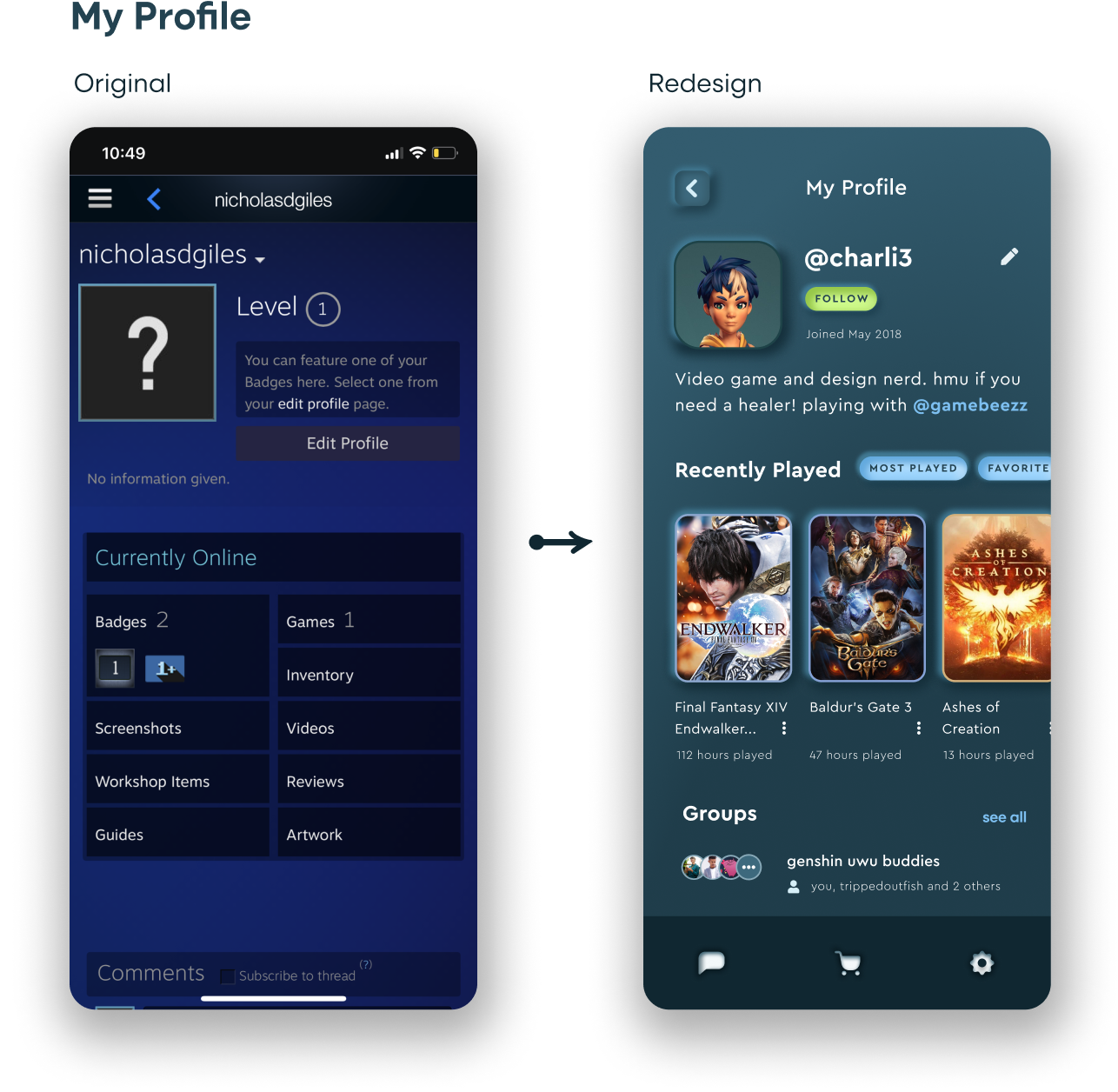
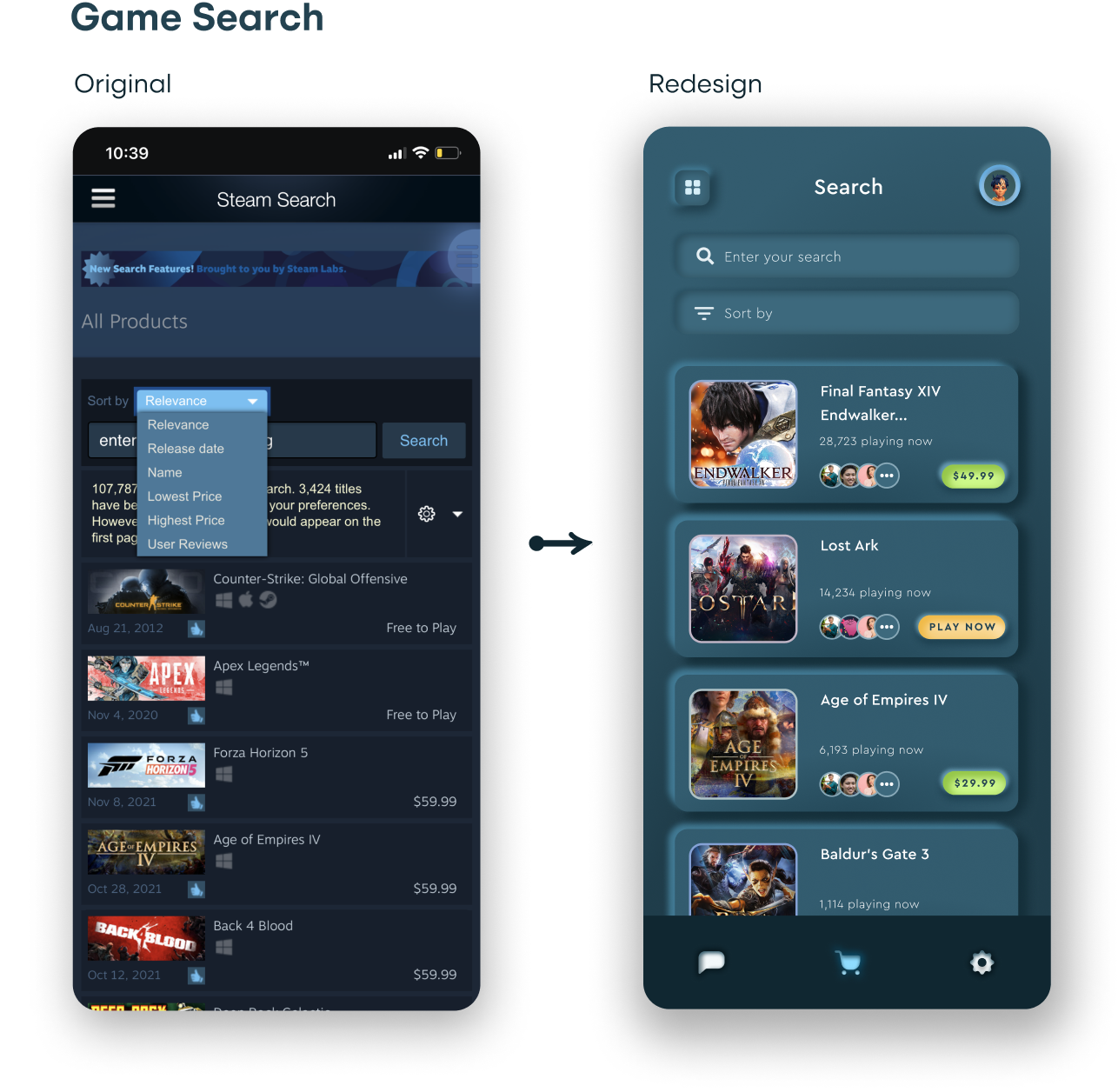
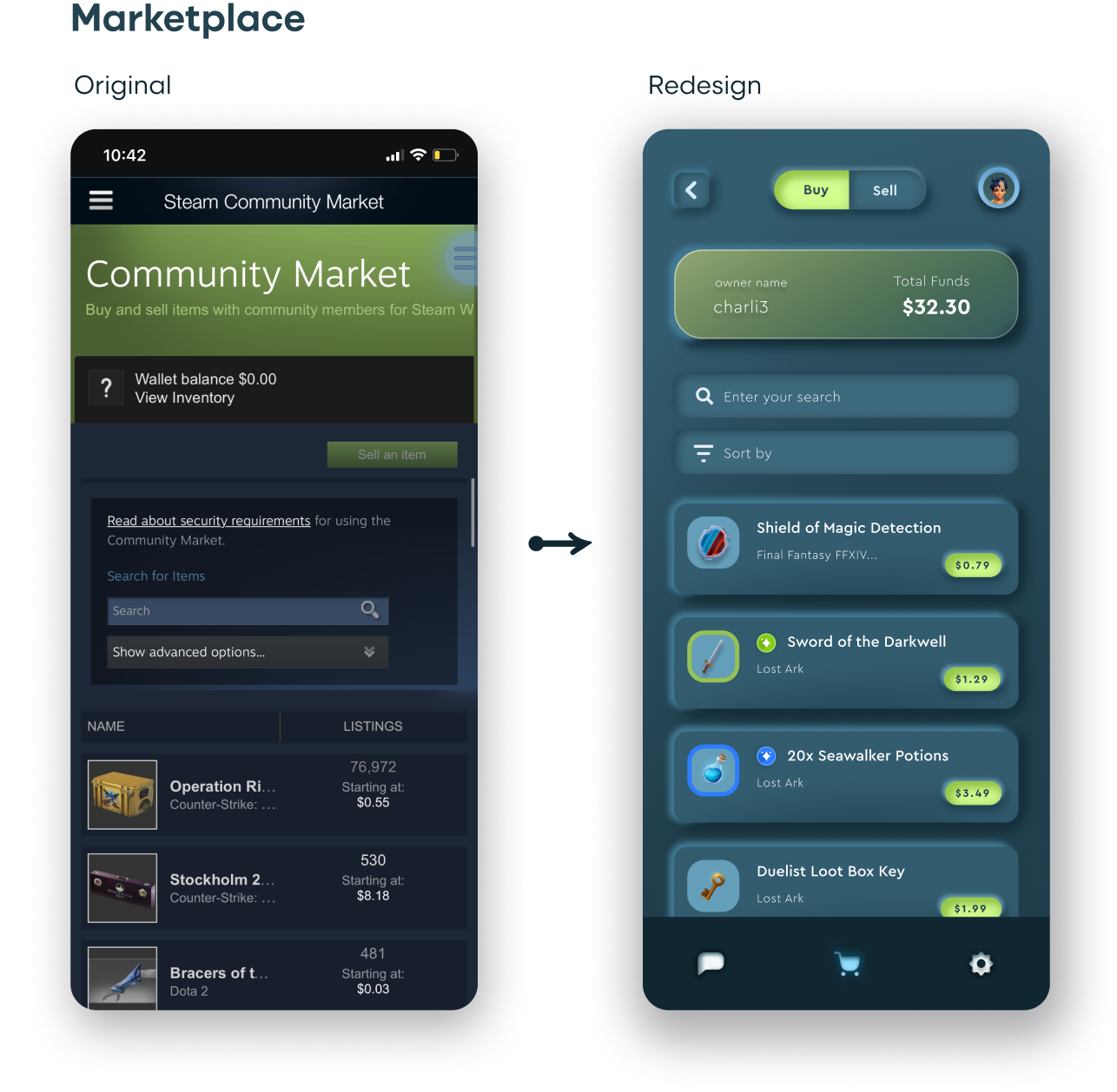
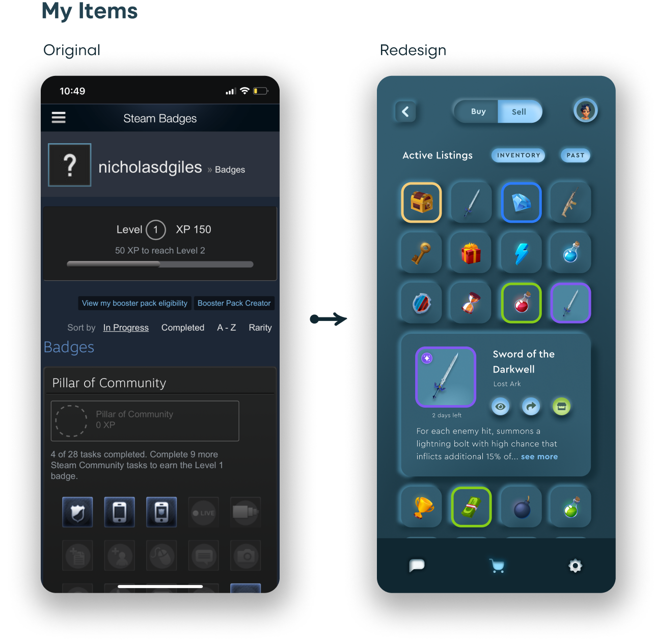
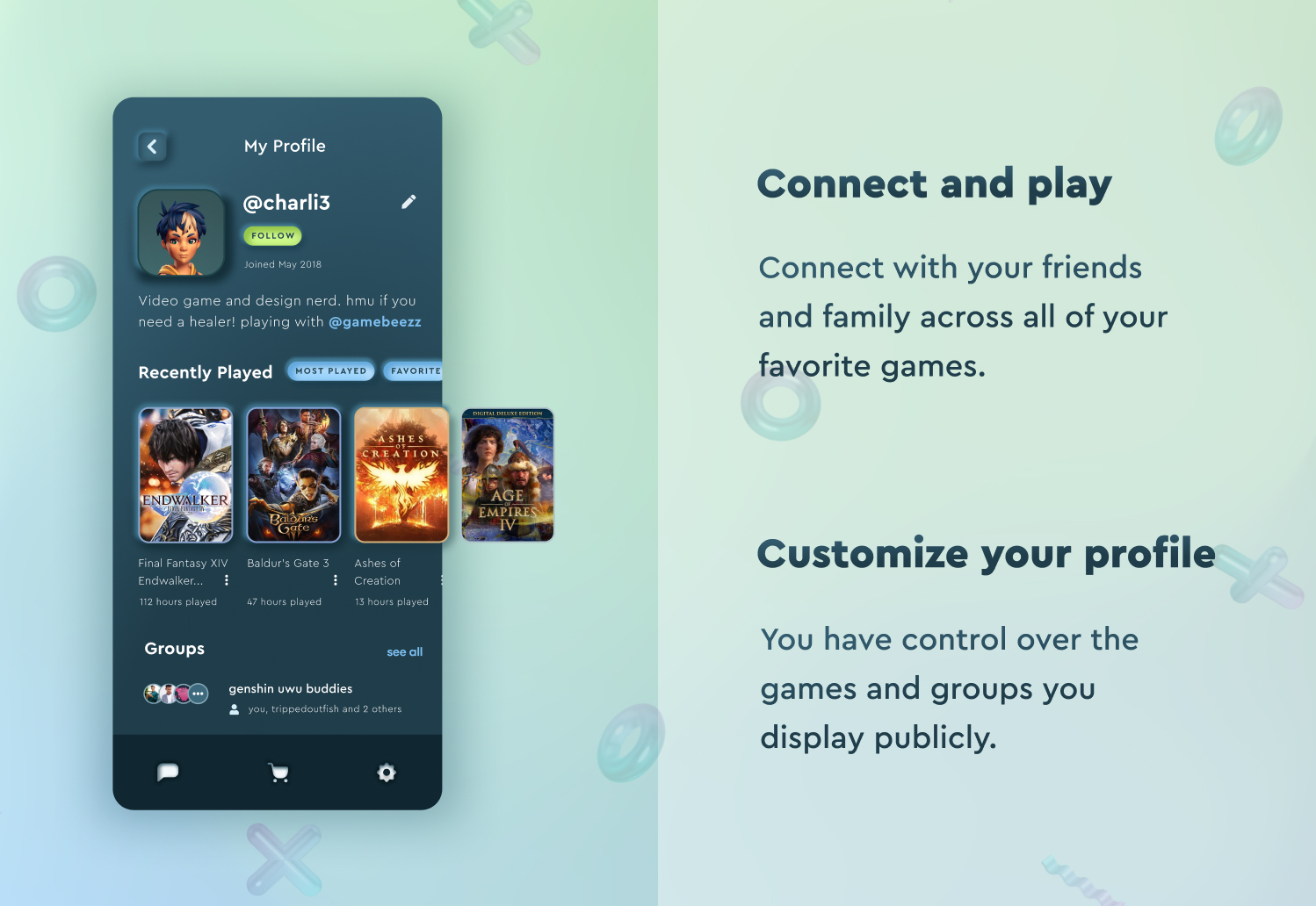
After creating wireframes, I began working on individual design components in Figma. I decided to utilize neumorphic design principles and built components with a 3D material design effect to ensure elements stand out from the dark background.
High-Fidelity Designs
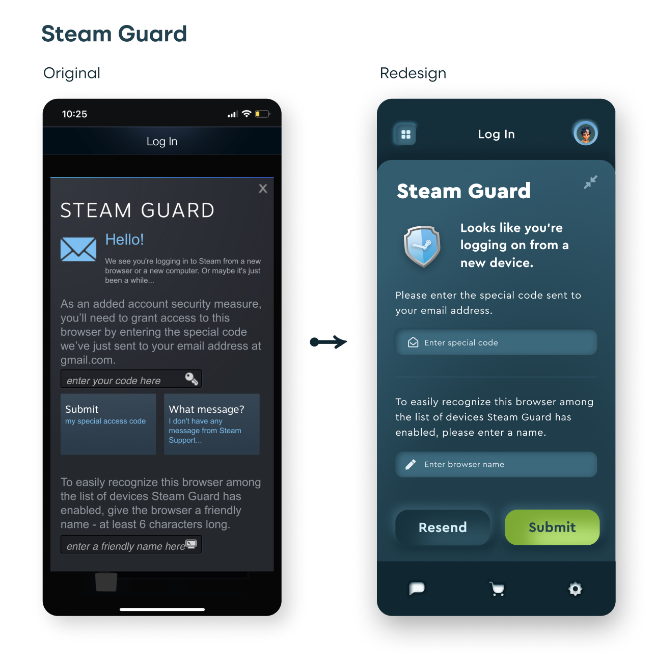
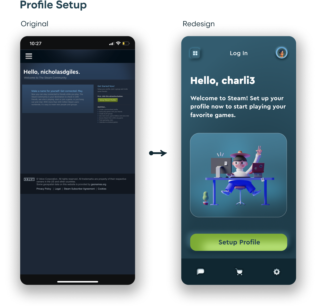
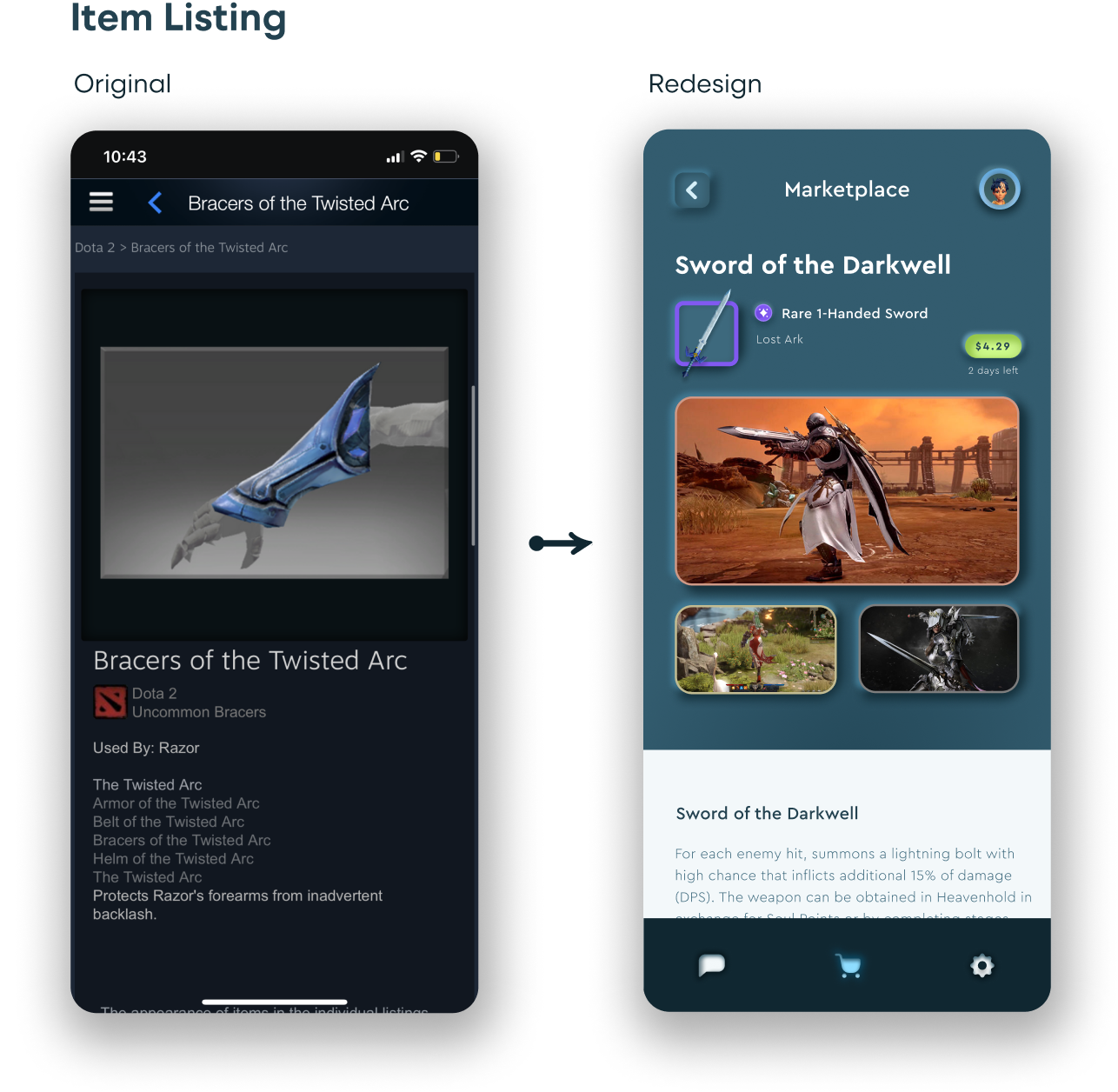
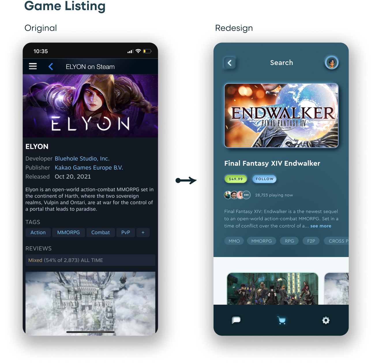
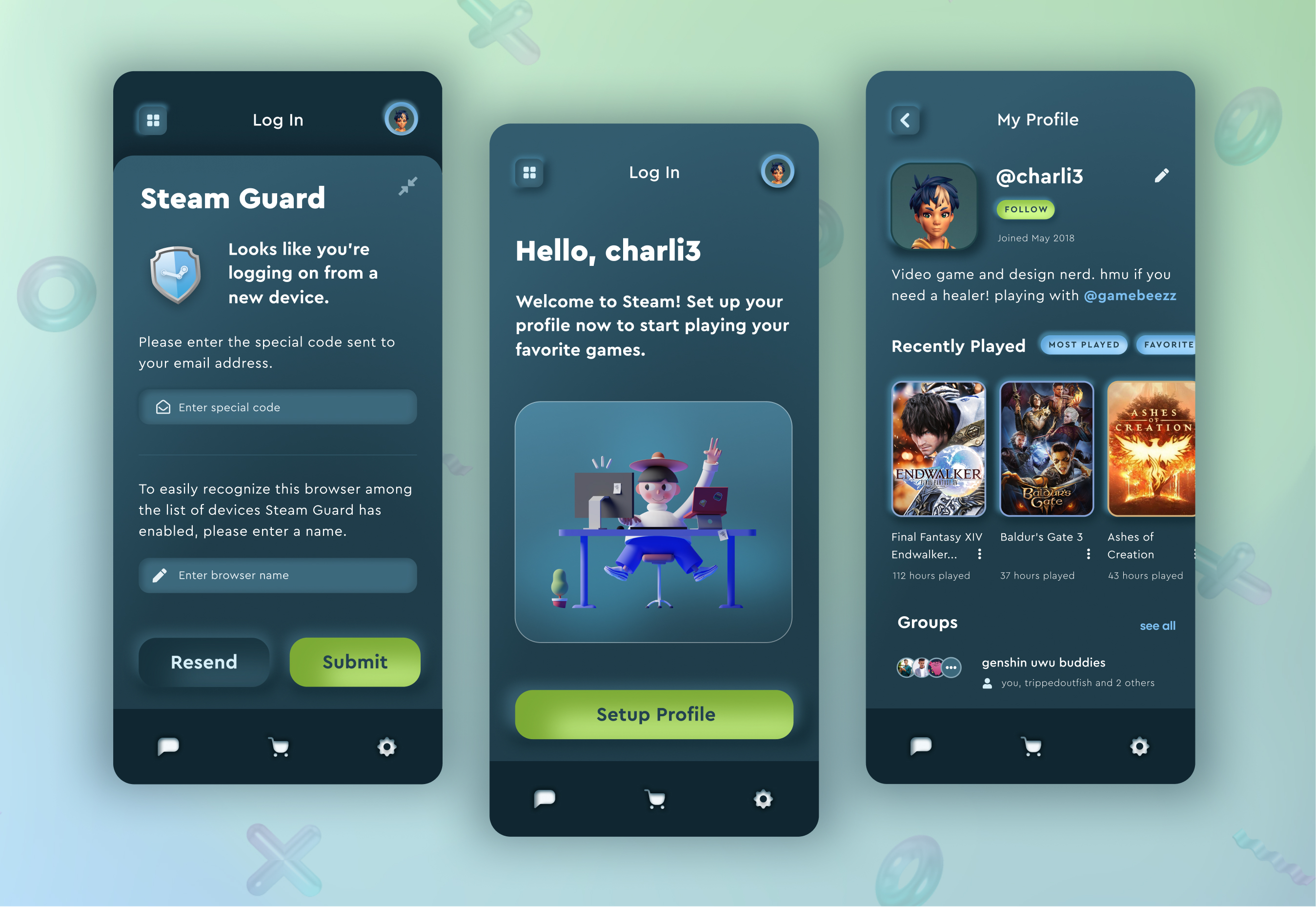
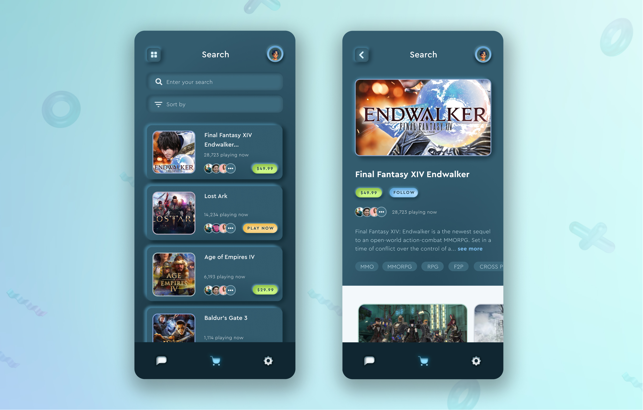
Eight high-fidelity mobile screens were produced utilizing the updated design components. For the background, I created a few gradients using the updated brand colors.


Reflection
Due to the accessibility limitations of neumorphic design (ie. not being suitable for low vision and elderly people), allowing for users to be able to switch between normal and neumorphic design mode, similar to dark and light mode, would be an important solution to impliment.
Additional next steps for this project would include recruiting users for usability tests, utilizing the existing Steam product in order to validate the initial insights generated from the heuristic analysis. I would also build a quick working prototype in order to test the redesign with users. Then I would take the learnings I generated to iterate on the high-fidelity designs.
