Plantcare Assistant
Design Problem
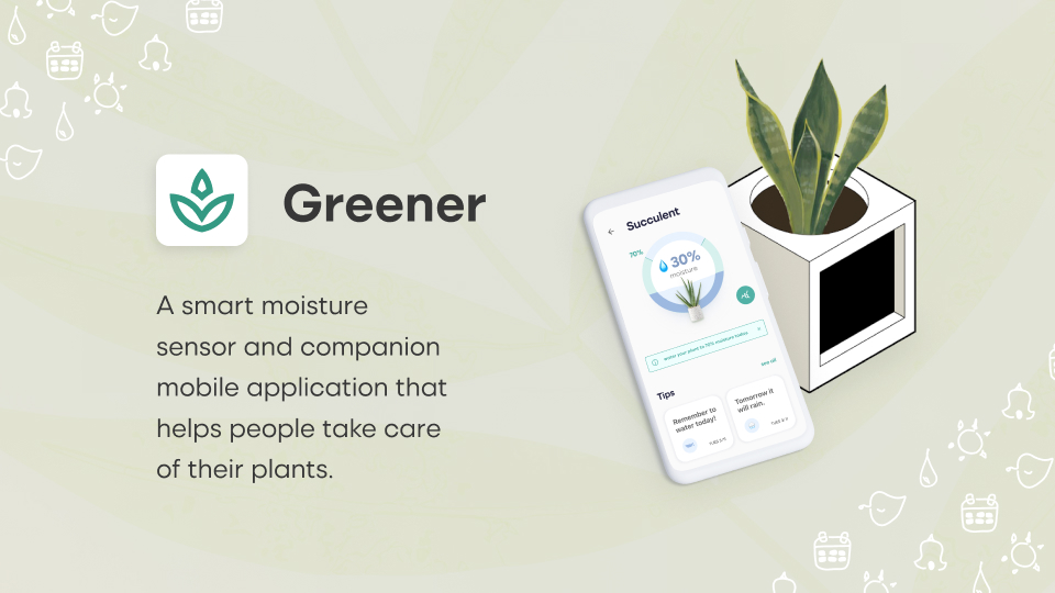
I worked on an interaction design project where I researched a domain of interest and designed a novel solution to address a problem. From my research, I decided to design a mobile application and soil moisture sensor that helps people take care of their plants.
Project Overview
- Course: SI 612: Pervasive Interaction Design
- Duration: Aug 2021 - Dec 2021
- Discipline: UX Research & Design, Interaction Design, UI Design
- Tools Used: Figma, Illustrator, Photoshop, Qualtrics
Approach
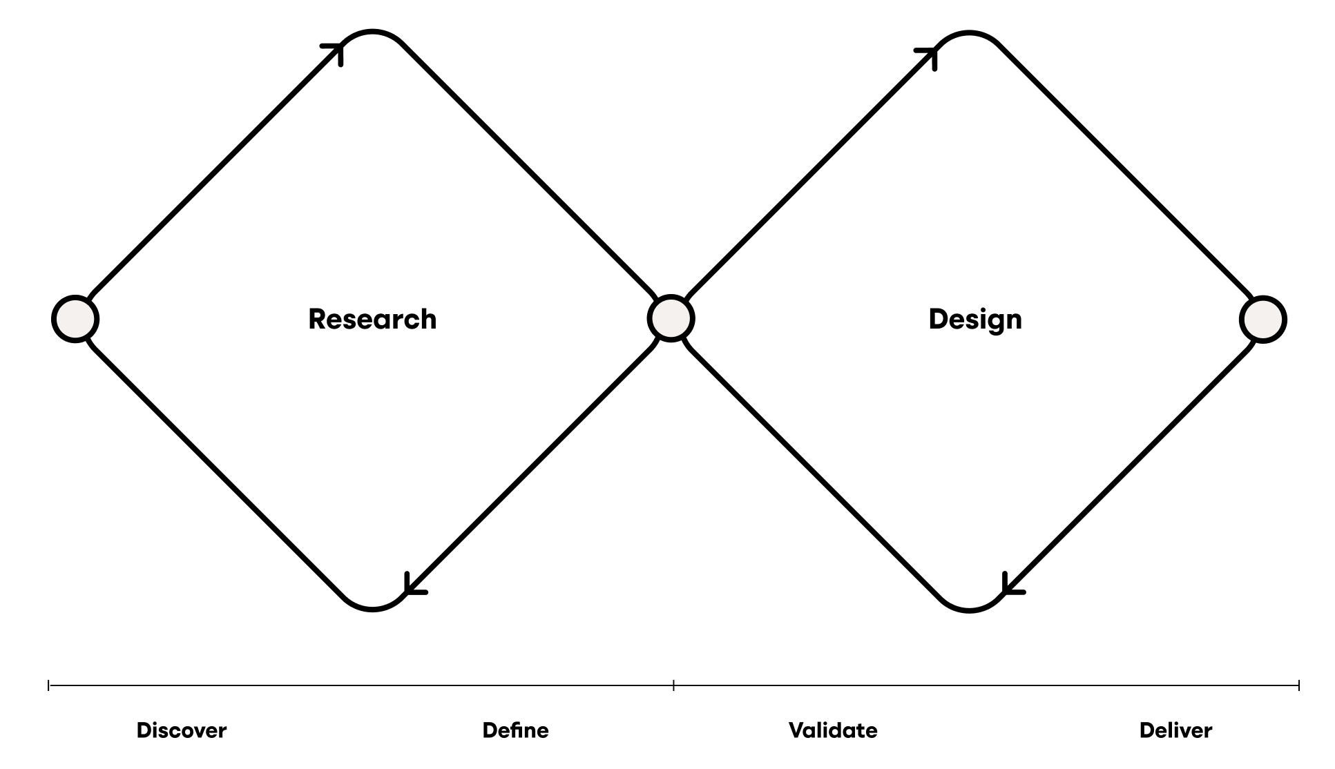
For this project, I followed the double-diamond design framework by beginning with research and deciding upon an area of interest for my design problem.
First, I conducted a cultural probe and sent out a survey in order to gain information on the plantcare domain and the people who participate in it. From there, I created personas, an empathy map, and a journey map. To explore possible solutions, I then conducted user enactments. From there, I was able to narrow in on a core set of features which I documented via storyboards and userflows. Finally, I built wireframes and designed a style guide and ultimately a high fidelity prototype.
Cultural Probe
I conducted a cultural probe in order to learn what motivates people to care for plants and how they feel about plant care. The study was done virtually to ensure safety during the COVID-19 pandemic. In order to mitigate any impact on the data, I created graphical representations of the probe materials to help users get a better feel for what was being asked of them.
The research questions I sought to answer with the cultural probe were:
- What motivates people to take care of plants?
- How does interacting and caring for plants make people feel?
- Does moral support and/or community (accountability) help motivate people to take care of their plants?
- Would education/information on plant care help people care for their plants?
- What are participants’ pain points/frustrations throughout the plant care process?
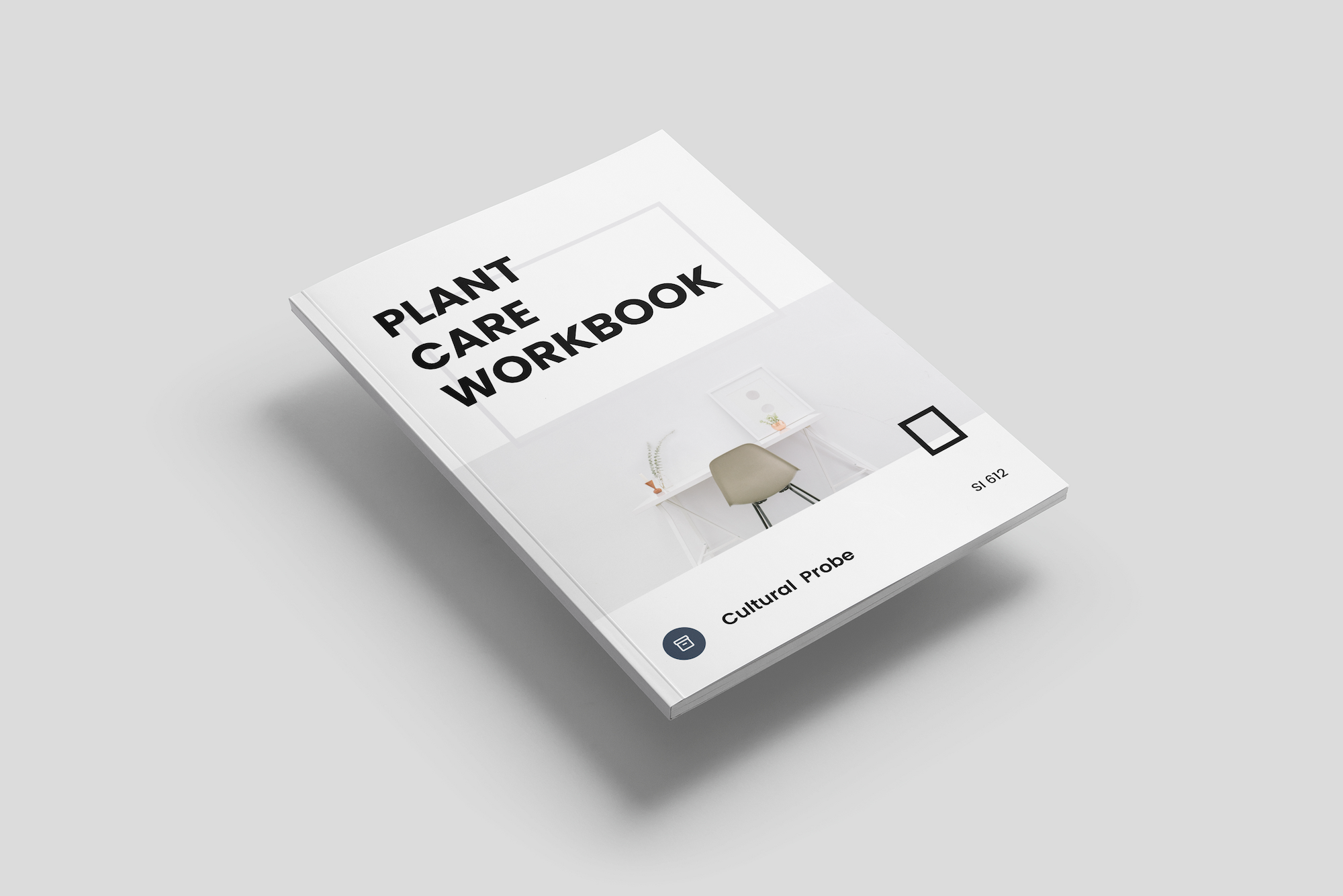
The Plant Care Workbook helped me gain insights on:
- Basic plant care info and photos
- Participants’ perception of their plant care work
- Info on local plant care community
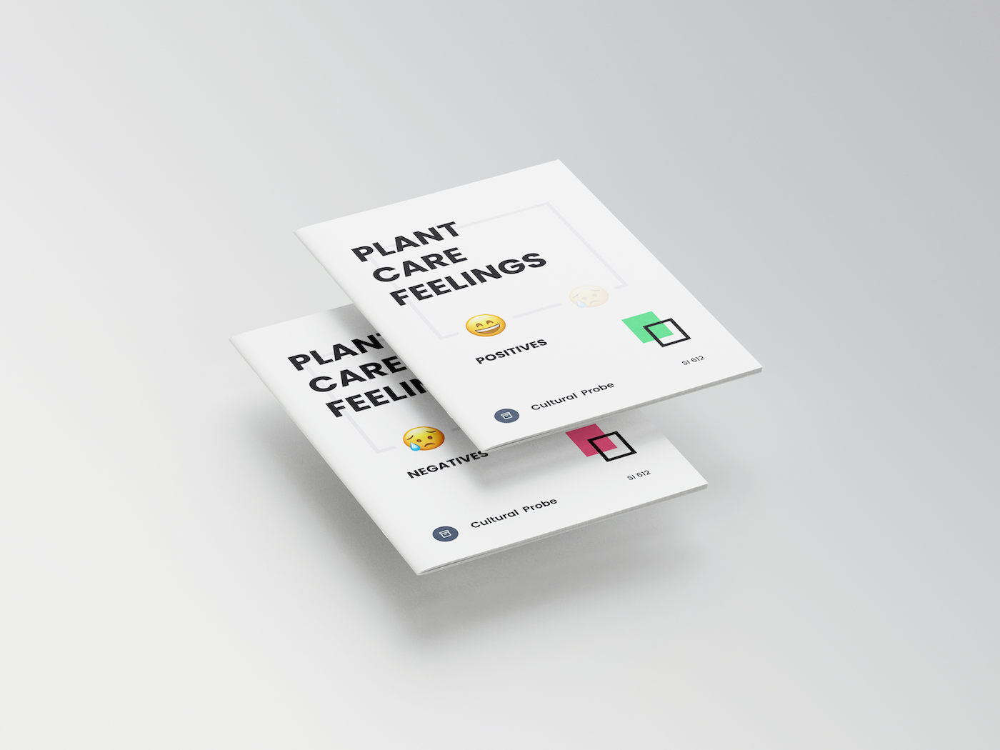
The Plant Care Feelings Workbook helped me gain insights on:
- Positives: benefits of plant care; how the benefits make participants feel
- Negatives: pain points of plant care; how they make participants feel
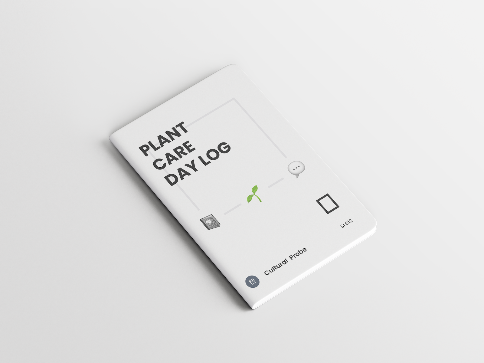
The Plant Care Day Log served as a mini diary study, and helped me gain insights on:
- Daily plant care work
- How those specific tasks make participants feel
From the cultural probe, I generated four high-level research findings:
Key Findings:
Survey
I then conducted a survey in order to validate the findings I gathered from the cultural probe, as well as to further dig into plantcare motivations, emotions, and shared responsibilities. I was able to recruit 35 participants and asked them to fill out a 10 question survey on Qualtrics.
Key Findings:
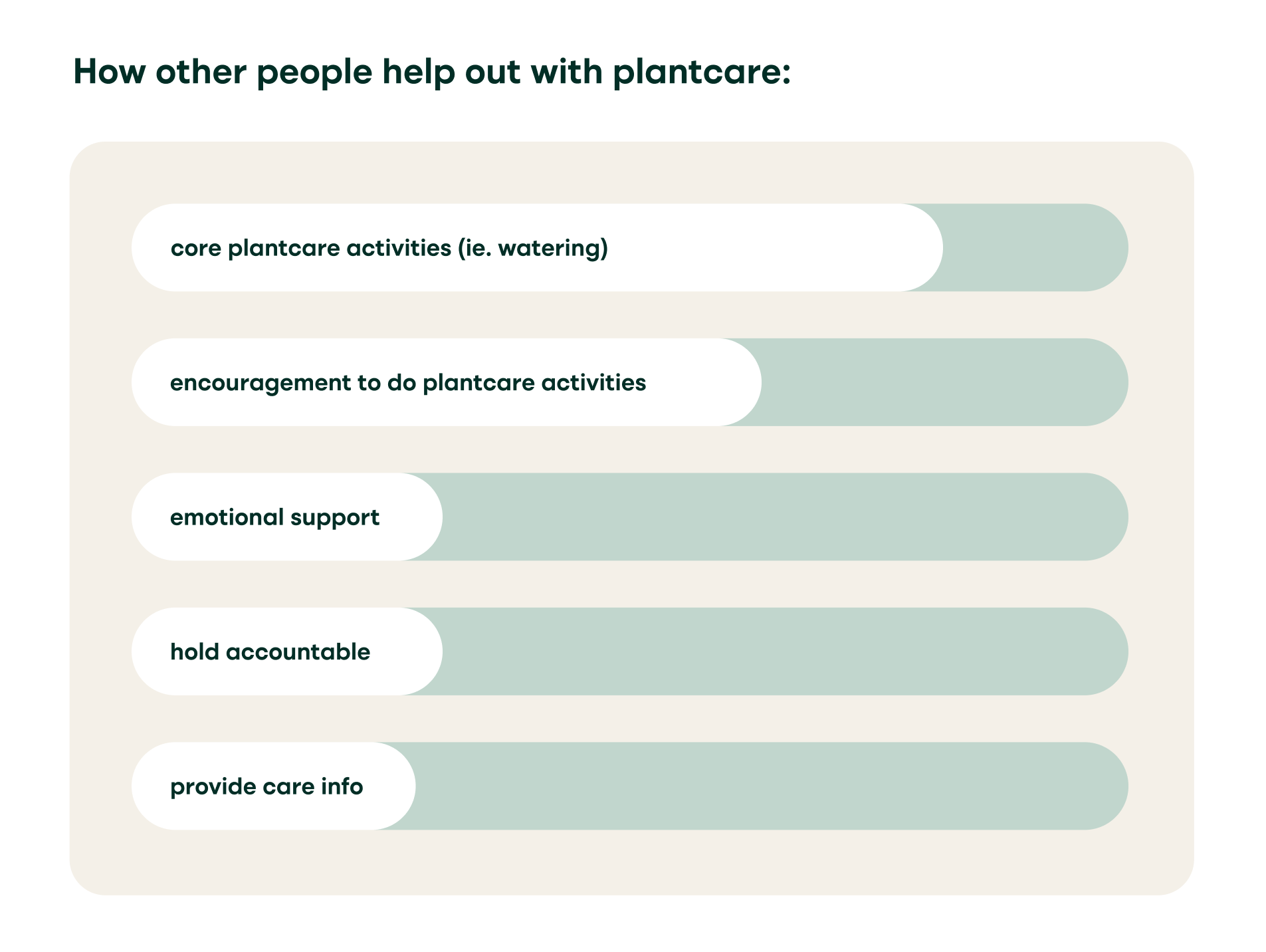
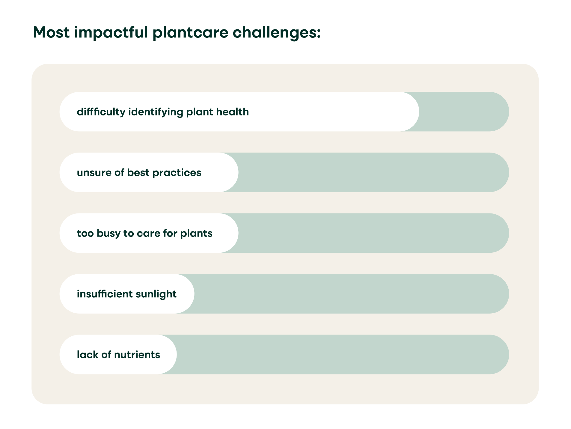
From the research findings, I generated personas, an empathy map, and a journey map.
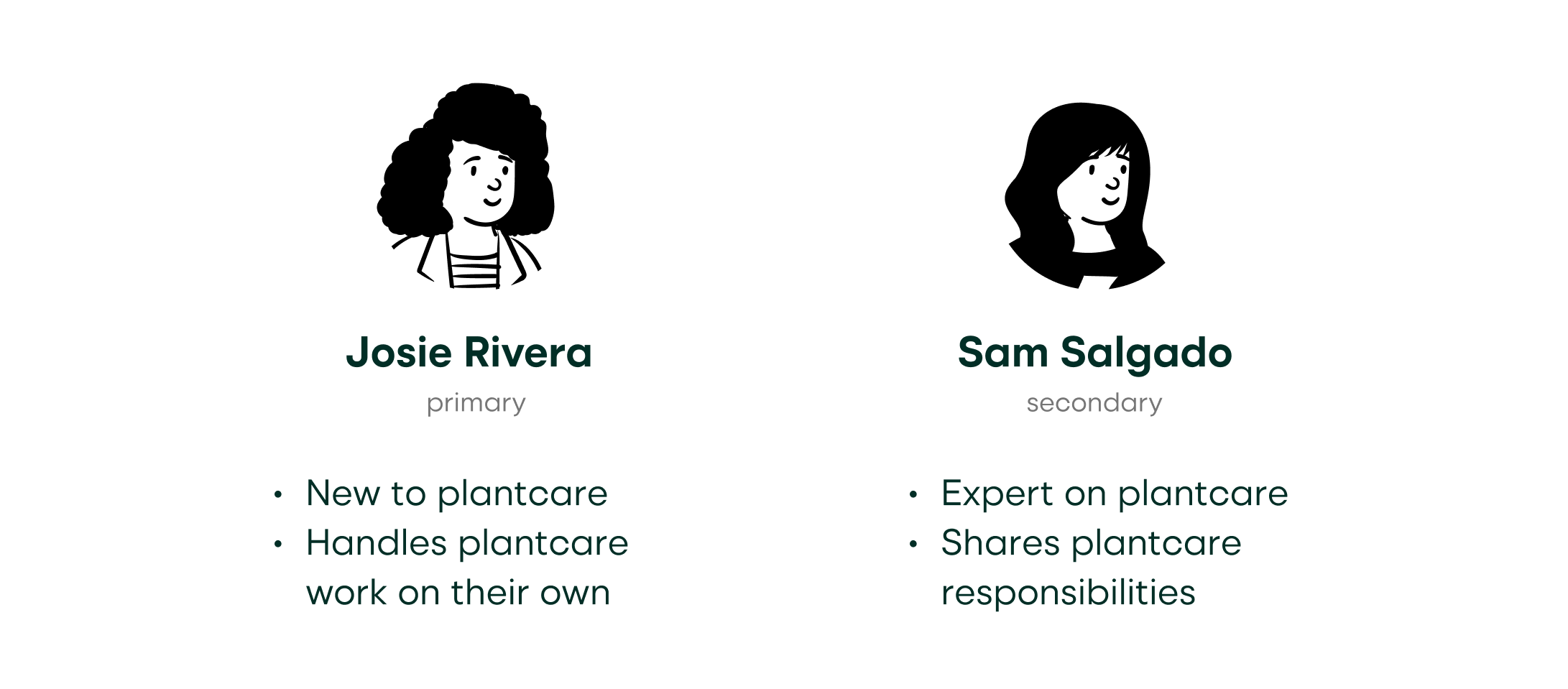
Personas
Two personas were created from the research findings; both a primary and secondary persona were built, as this would help me make product decisions and prioritize feature sets down the road.
Empathy Map
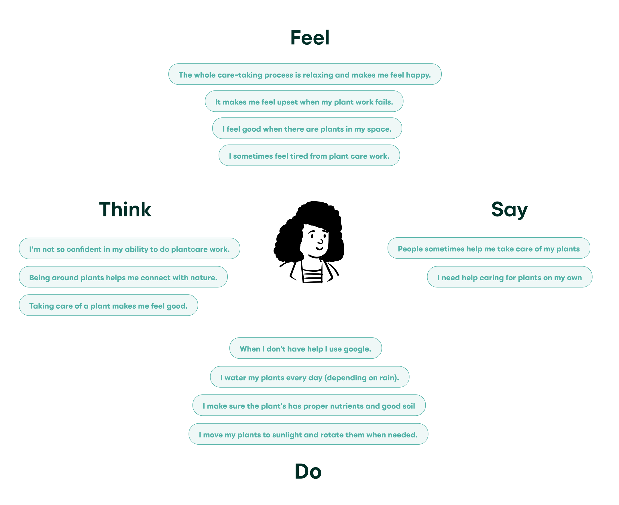
An empathy map was created for the primary persona, which describes what the user says, does, feels, and thinks in relation to plantcare work.
Journey Map
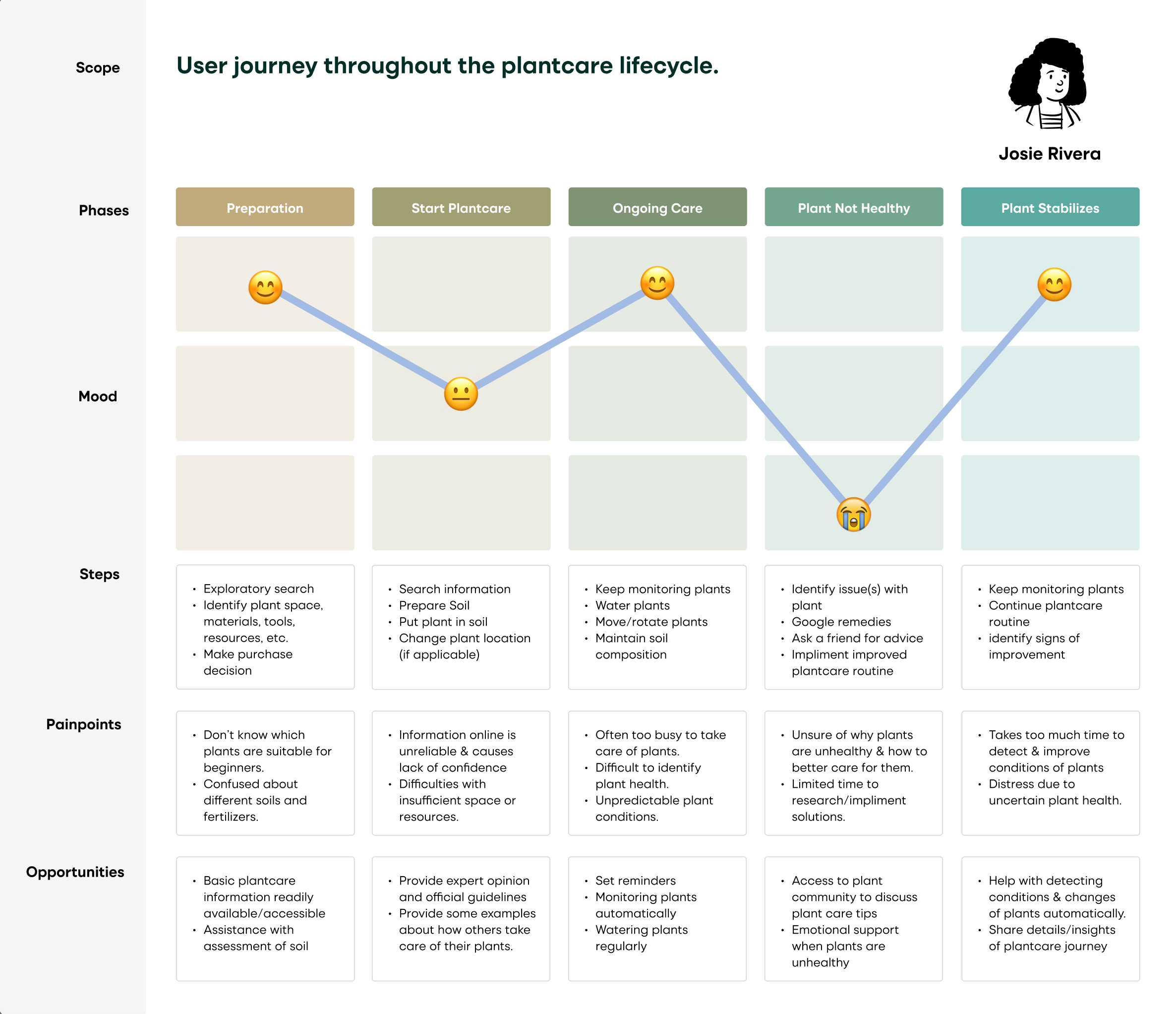
I created a journey map which tracks the users’ mood throughout the plantcare lifecycle. This helped me identify pain points and resulting product opportunities.
User Enactments
I also decided to conduct user enactments in order to test out the different design options I had come up with. The questions I sought to answer with the user enactments were the following:
- What is the minimal viable function the product needs to achieve to help users take care of their plants?
- How much user control do participants prefer and what level of automation are they comfortable with?
- What potential error cases would come up and how should we go about designing for them?
I recruited three participants and created scripts and wireframe props for the user enactments in order to get quick insight on a handful of possible user scenarios.
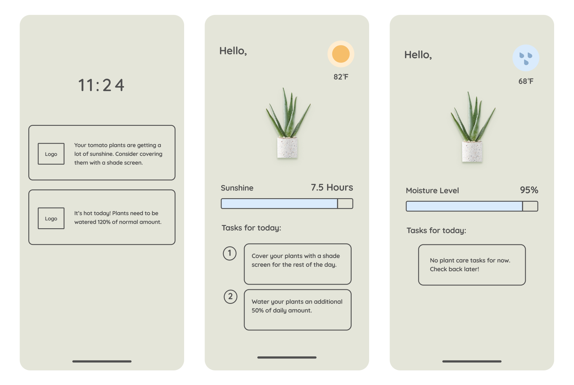
After conducting the user enactments, I added all of the notes to an affinity wall, clustered them into like-themes, and generated high-level insights that would go on to inform the end product.
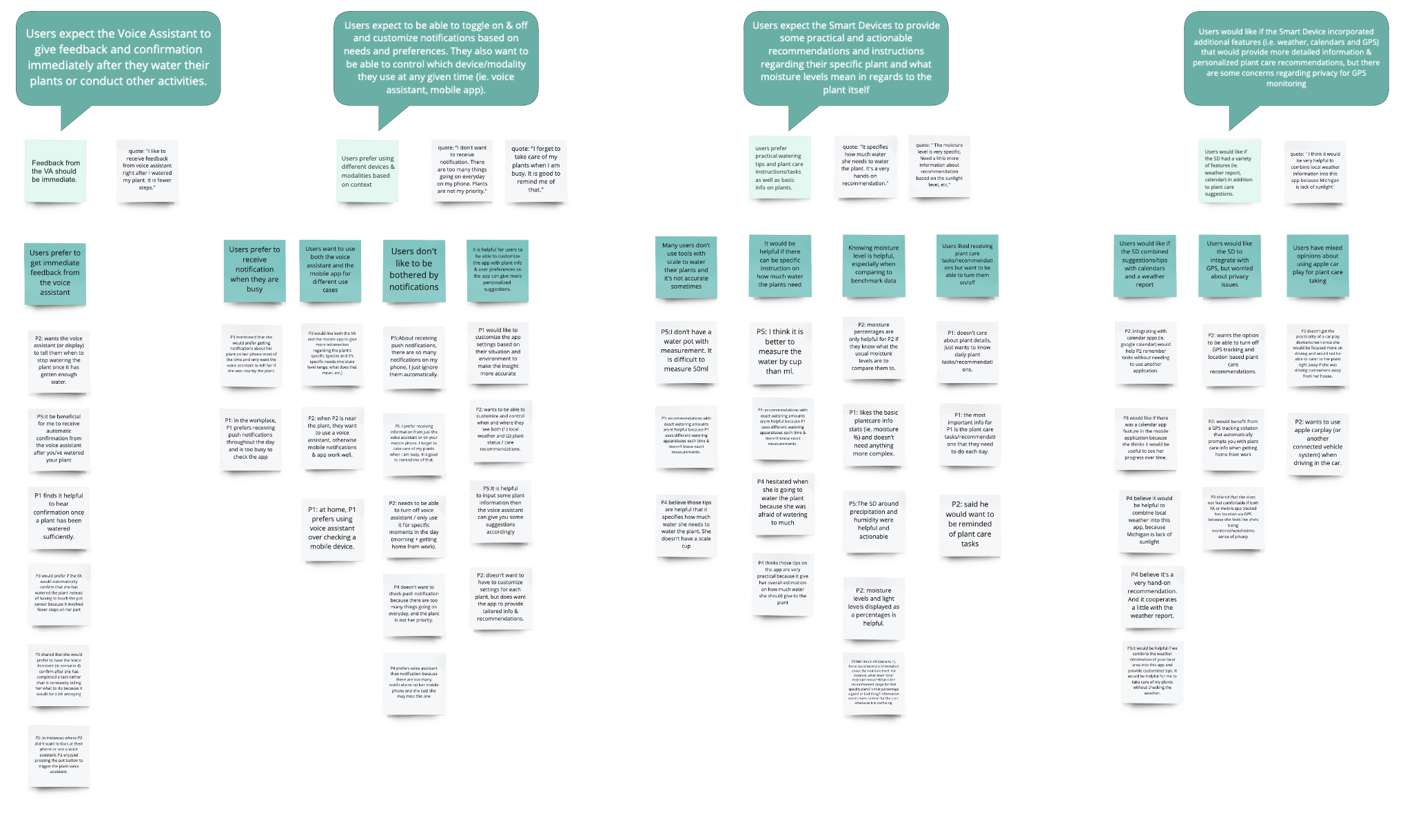
Key Findings:
Ideation
From the user enactment findings, I did another round of brainstorming and sketched out possible design features and solutions.
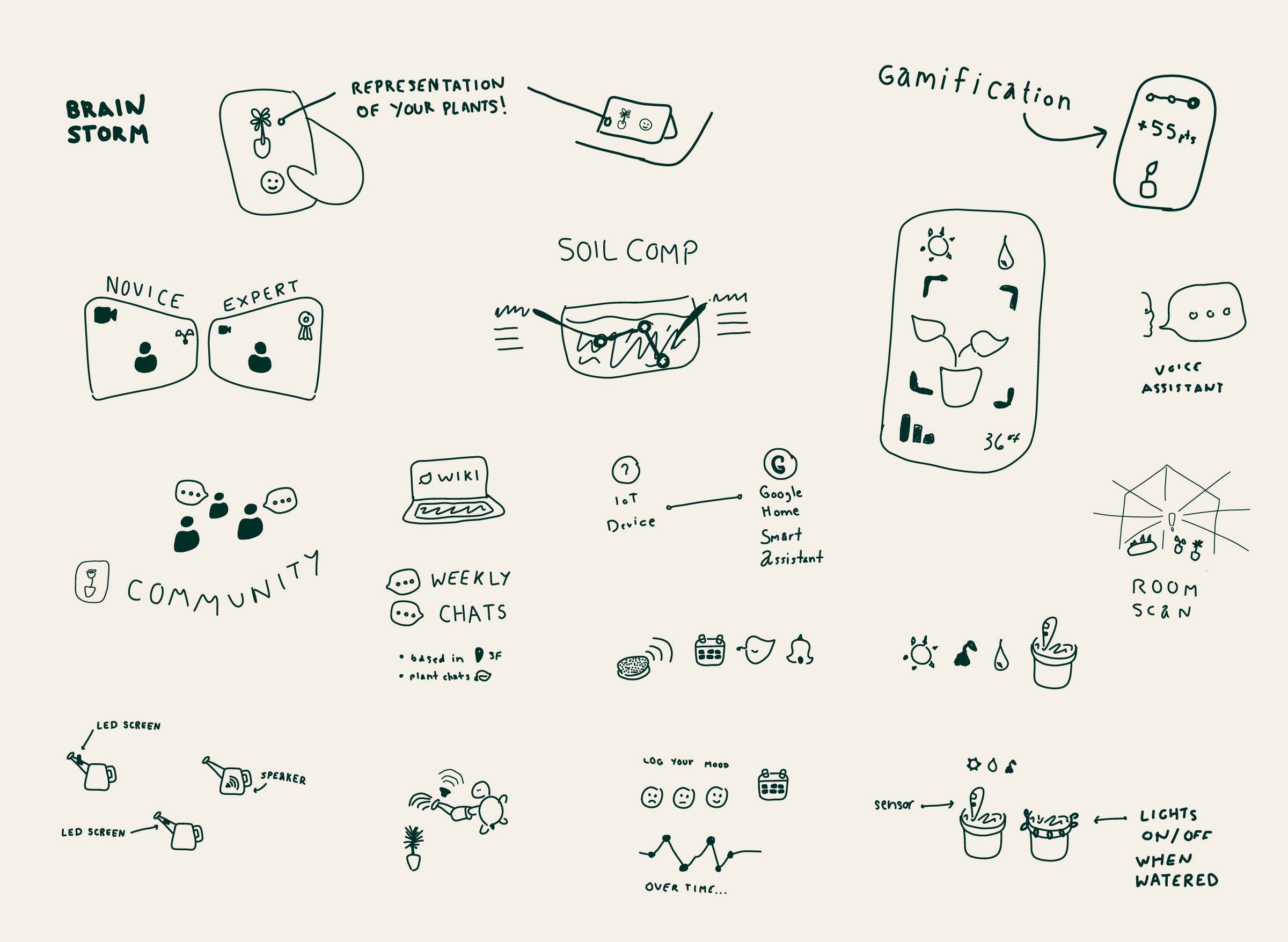
I then documented core product attributes that address user needs, and evaluated my new ideas based on the following criteria:
- Relevancy to plant care: the solution addresses the needs of users who do plant care work
- Feasible to implement: the simpler the solution, the easier the product will be to build.
- New ubiquitous technology: meets the definition of UbiComp , is a novel concept, and is built using computational media.
- Ease of use/durability: the product needs to be intuitive and easy to use and should easily fit into users’ environment and routines. This includes being resistant to water damage and durable so users don’t need to worry about breaking it.
- Highly customizable: device, notification, and privacy settings can be customized to users’ needs.
- Single device/platform: the solution should focus on a single device/modality that works best based on context (ie. voice assistant, mobile app, carplay, connected home, etc.).
Storyboard
Following the evaluation of the newly brainstormed ideas, I crafted a storyboard that helped me start documenting specifications for a minimum viable product.
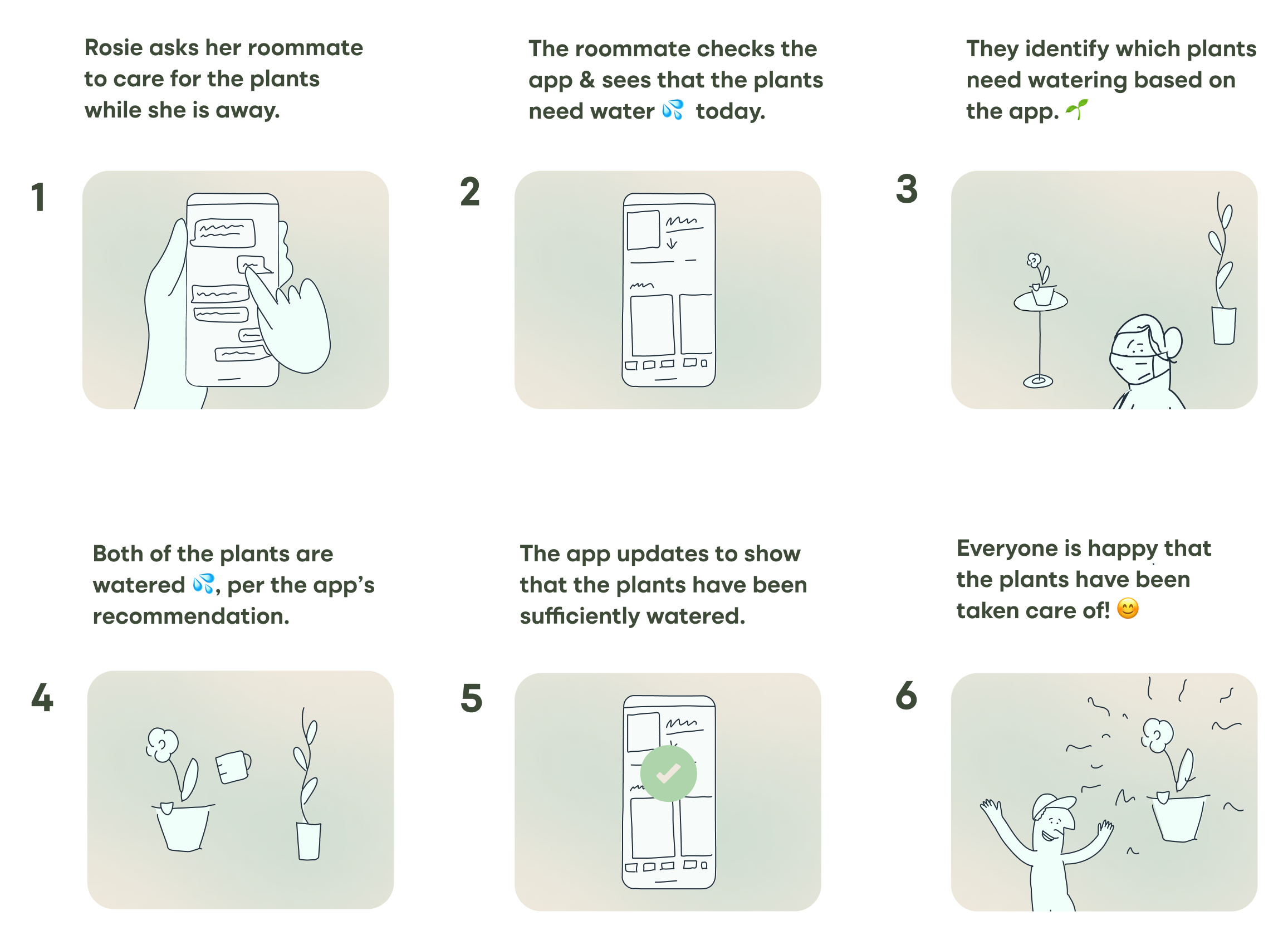
Userflow
I also created an abbreviated userflow to align on a minimum viable product. By focusing on a happy path for the user, I was able to document the primary flow that would constitute the user experience.
Wireframes
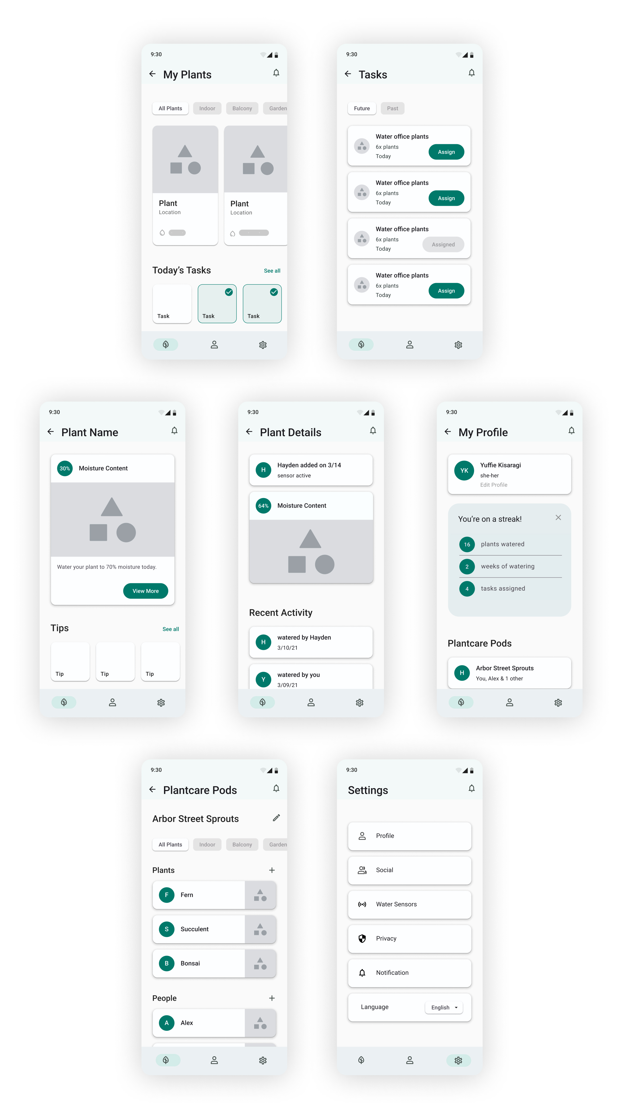
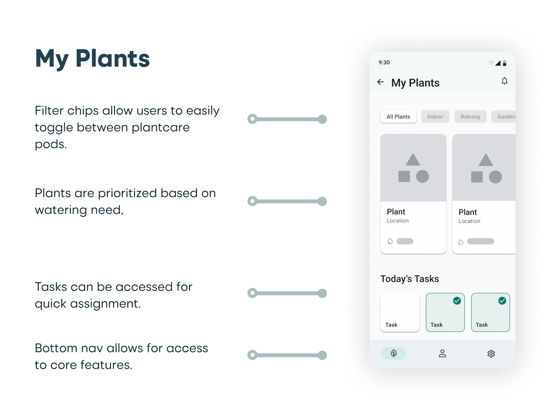
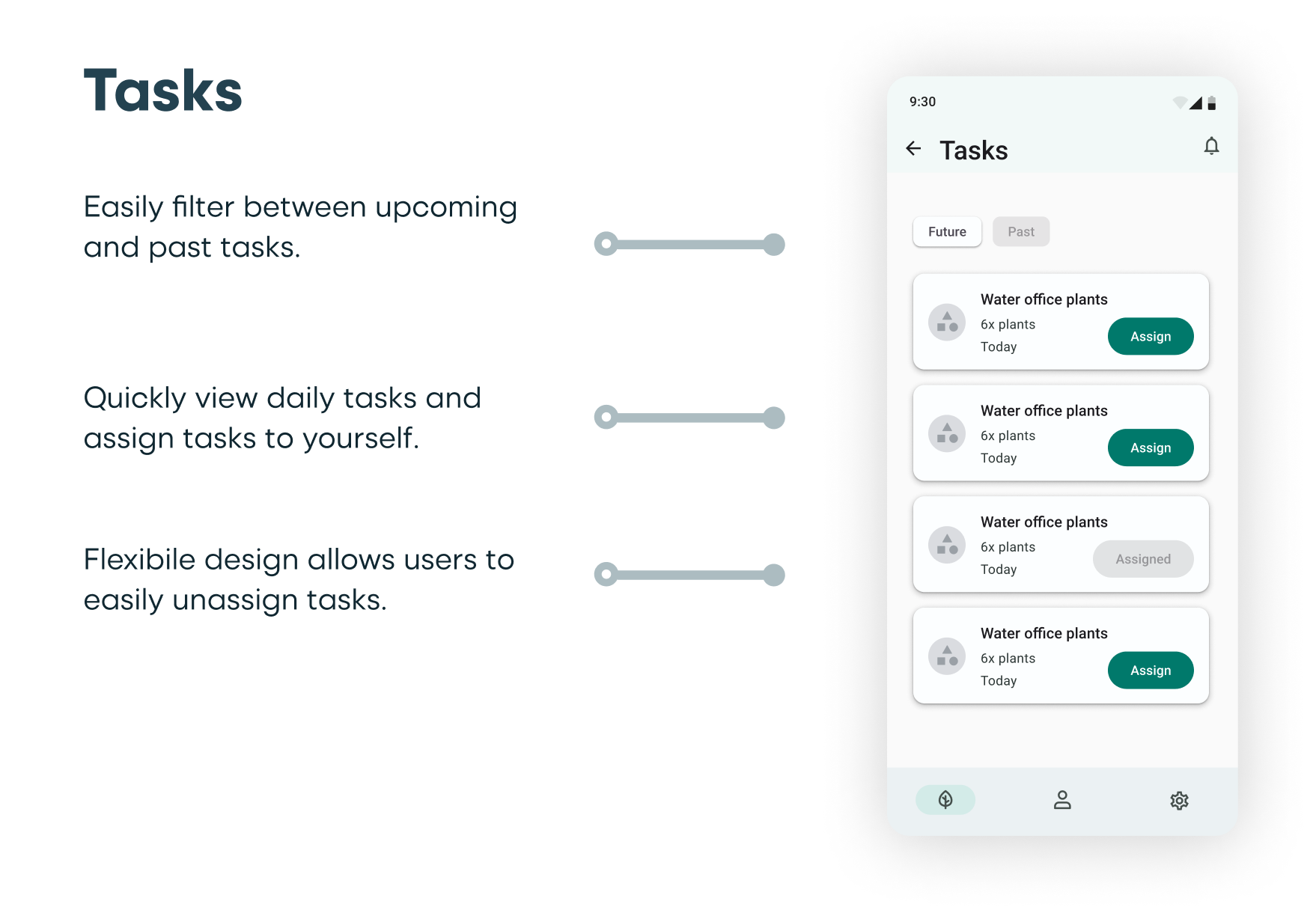
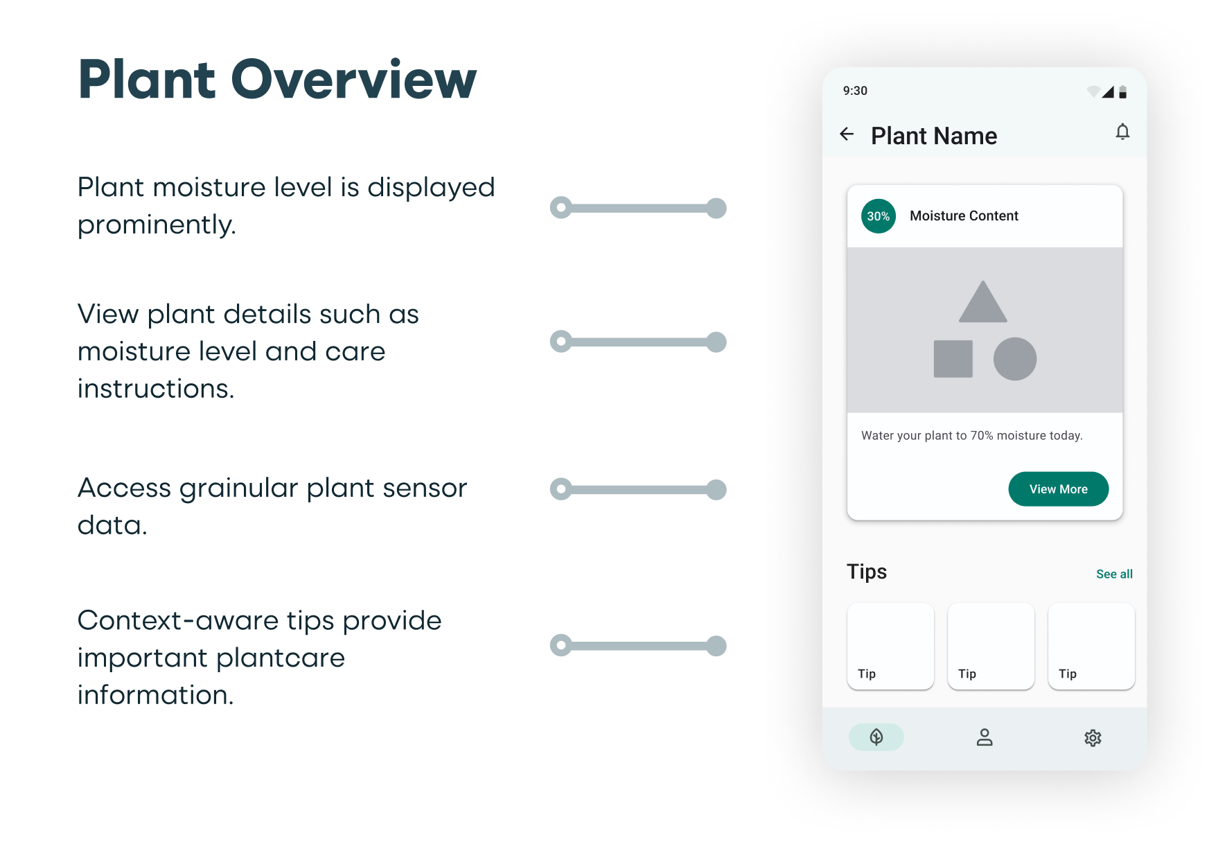
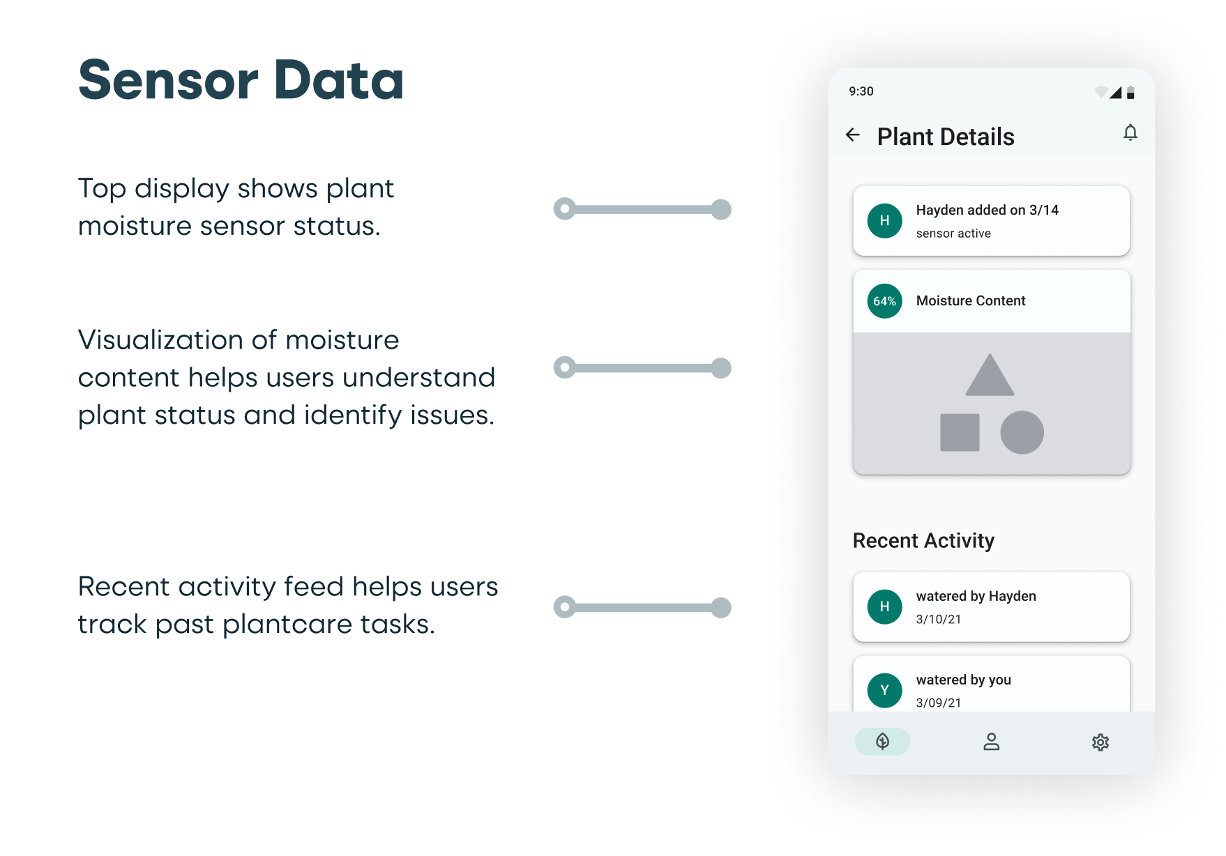
After developing a storyboard and userflow, I crafted wireframes that cover the core product experience. The wireframes were made using Google Material Design 3.0 components in Figma. Utilizing Material Design elements allowed me to quickly create wireframes that meet development and accessibility best practices.
Style Guide
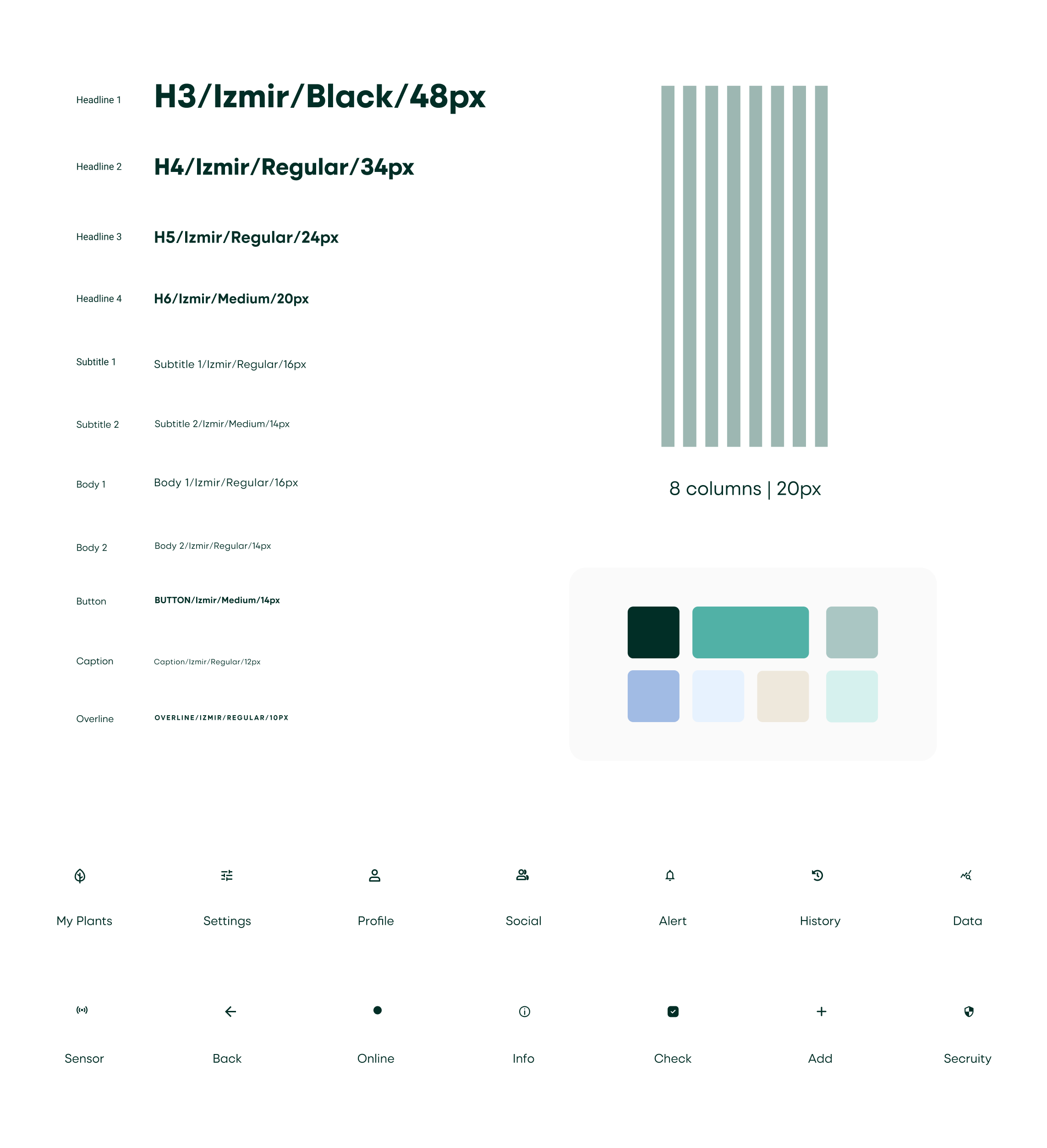
The color pallete was inspired by plant foilage and includes green and tan colors. I decided to utilize a card system with rounded corners to create a playful feeling. It was also important to use ample white space to ensure the app appears clean and organized.
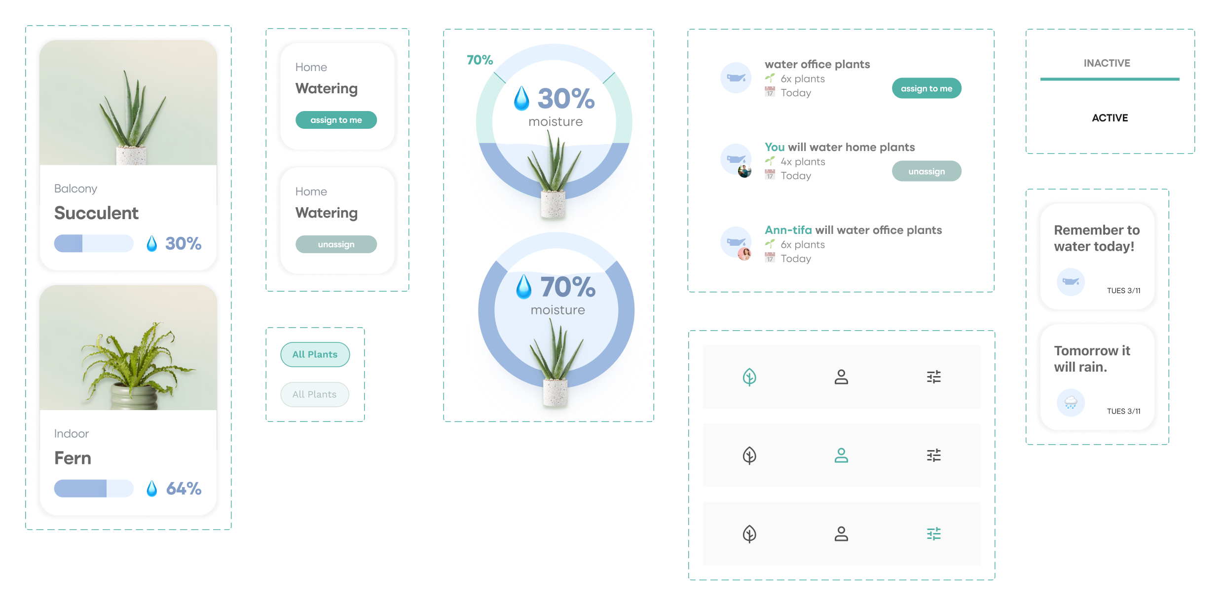
Design Components
Design components were created in Figma using auto-layout and variants; I used them to build high-fidelity screens and a working prototype.
High-Fidelity Designs
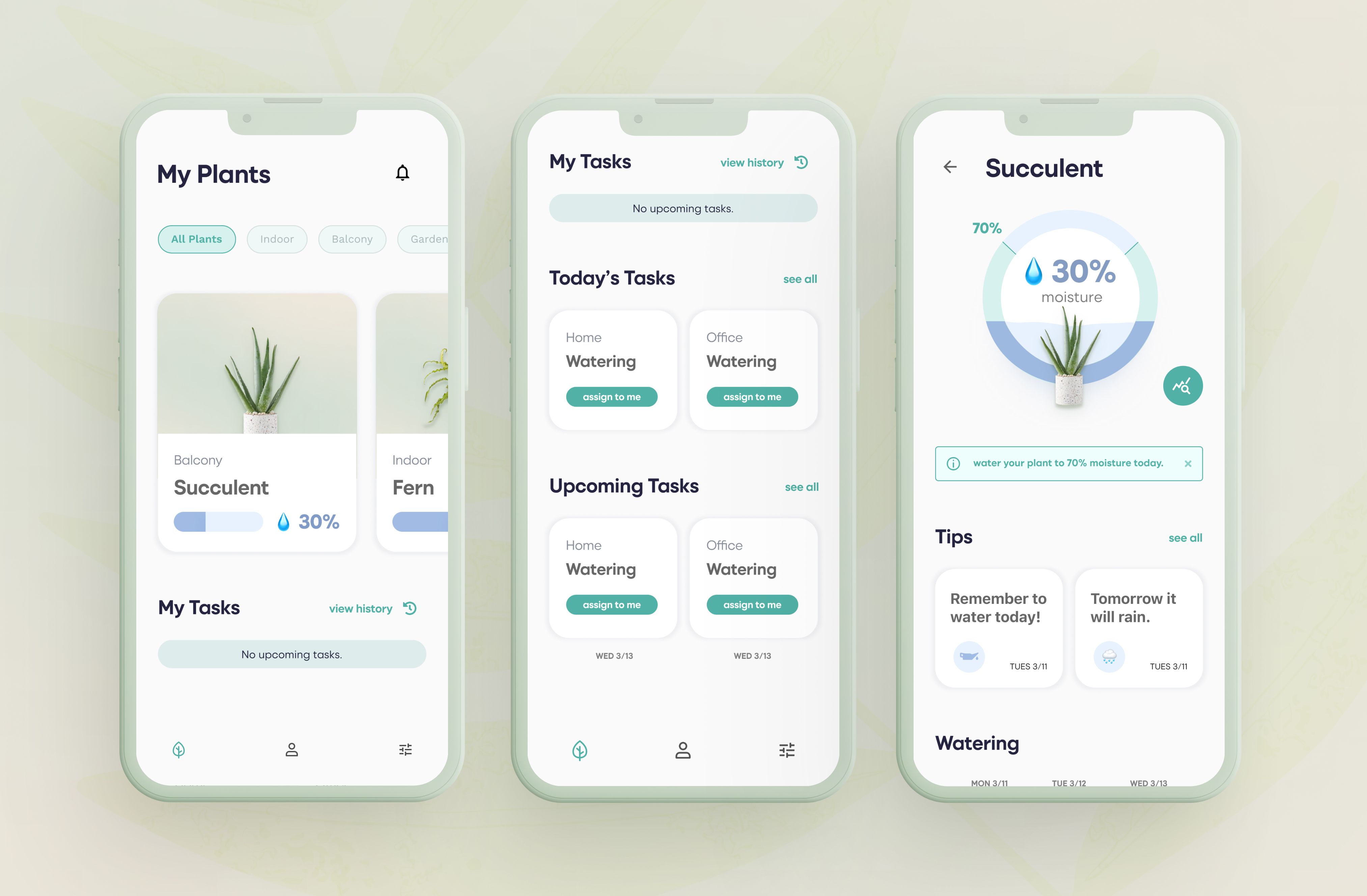
The high level feature points for the final product include:
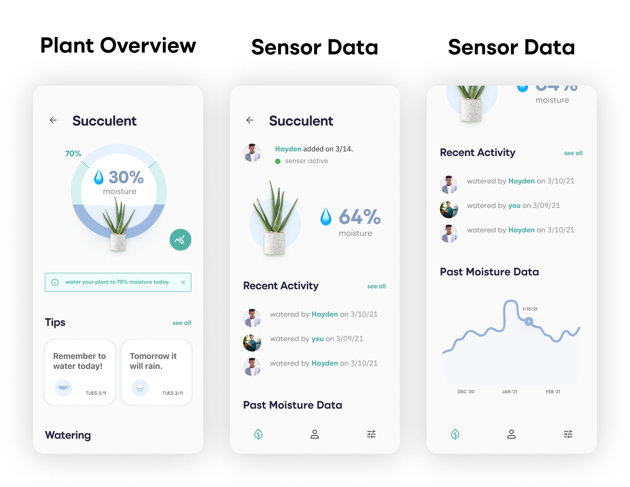
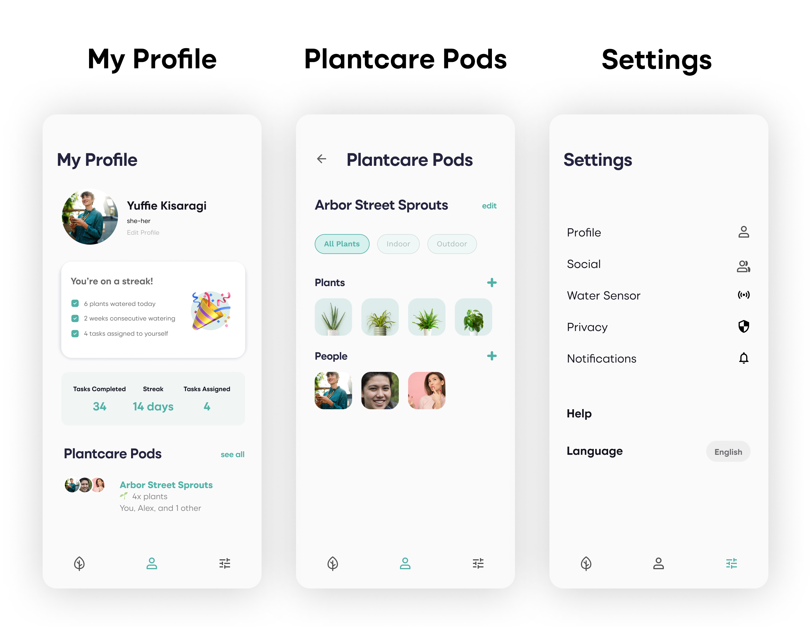
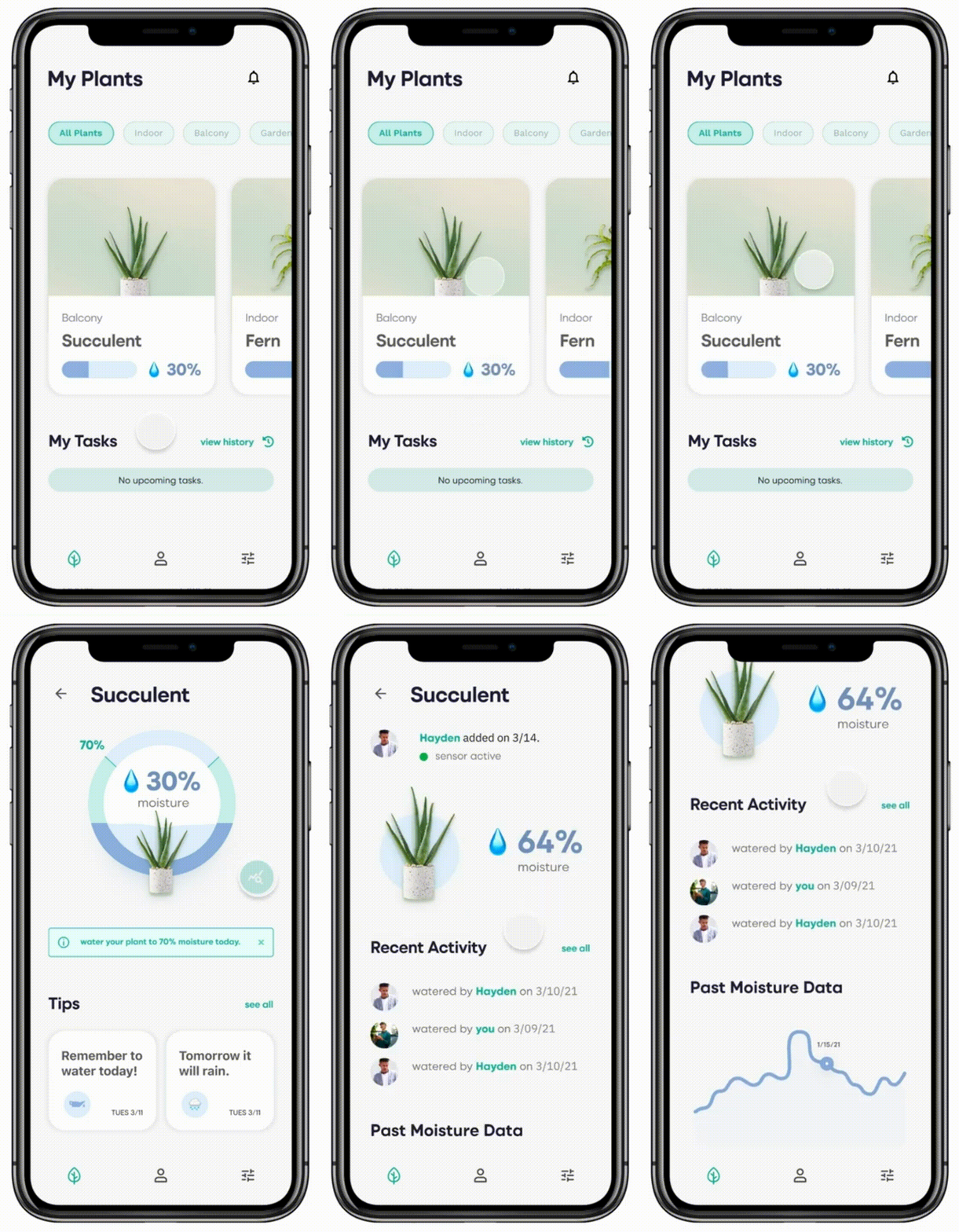
- Monitor Plant Status: the companion mobile app includes progress visualizations that indicates how much water has been added to your plant’s soil and how much water is still needed.
- Actionable Plant Care Insights: the plantcare assistant senses moisture in the soil and helps users easily understand their plant status by providing helpful recommendations.
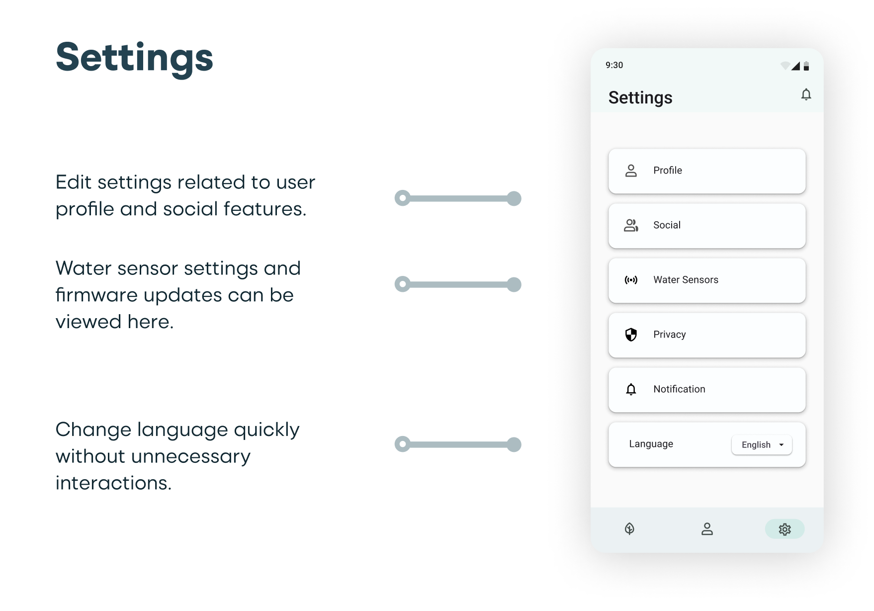
- Control Notifications: the plantcare assistant allows users to toggle on/off the notification based on their own preferences and needs.
- Personalized Plantcare Reminders: users can input plant details into the companion app to further tailor plant care recommendations.
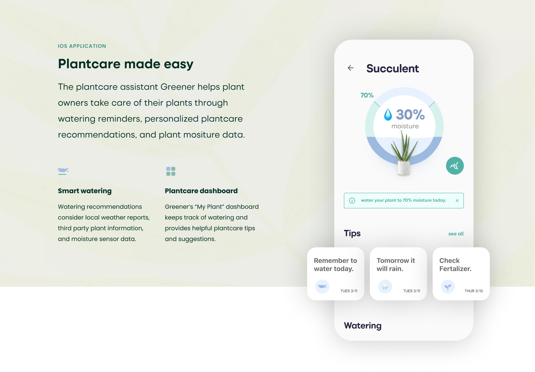
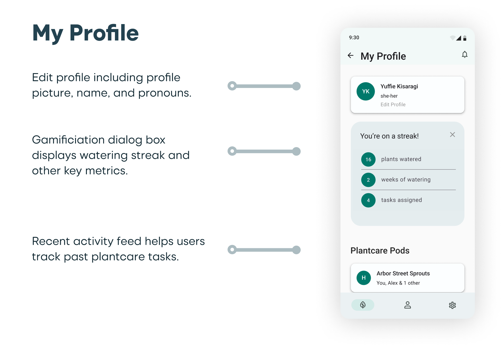
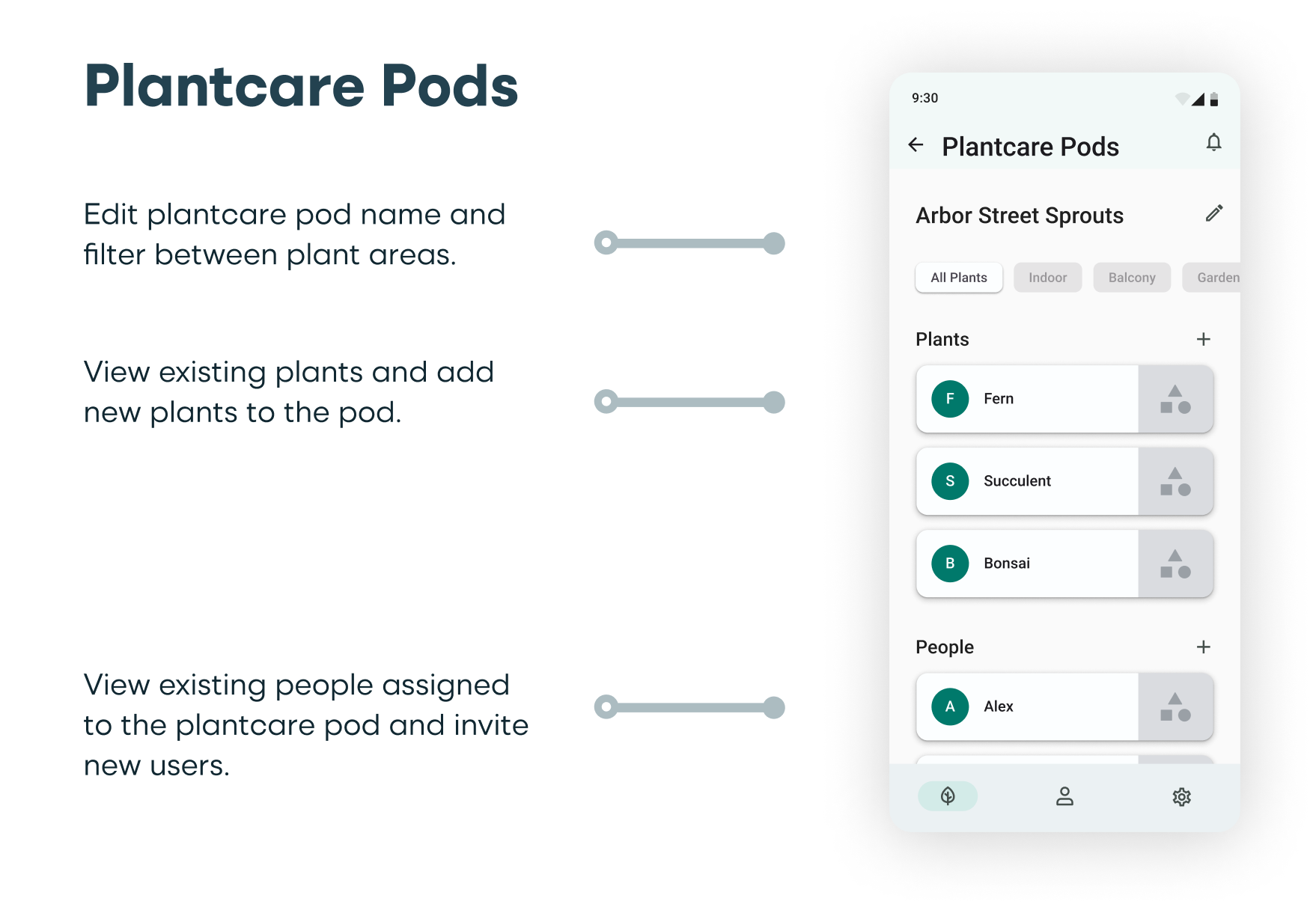
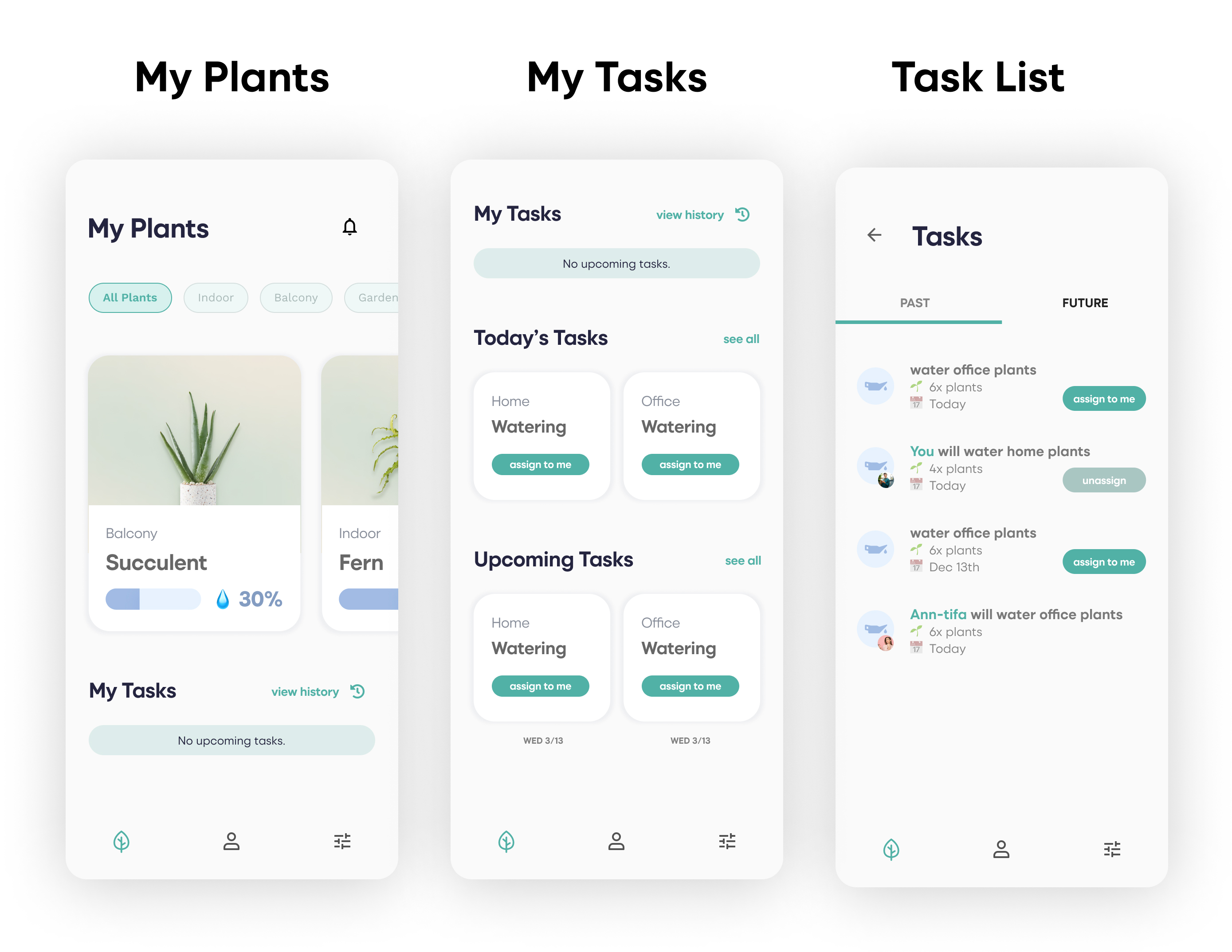
The high fidelity screens were designed to include a plantcare dashboard, task assignment modules, and individual plant details, as well as social features and customizable settings.
Reflection
During the user enactment sessions, users had expressed that they wanted additional details on plant moisture levels. For future iterations of Greener, I would look into providing more specific plant moisture measurements and instructions for users. Additionally, manual input of plant care details could be added to allow for more personalized plantcare recommendations, however, it would need to be a compelling user experience in order to entice users to do so. I would start by conducting usability tests with an updated high-fidelity prototype and use those insights to iterate and improve the user experience.
