Backyard Reviews

Design Problem
In the midst of the Covid-19 pandemic, small businesses in the United States are struggling to keep afloat. Consumers are increasingly relying on online shopping from large retailers such as Amazon. Through user interviews, we found there is a need for geographic-specific and centralized tools to guide consumers towards local business alternatives.
How can we enable people to (1) more easily divest from large retailers and businesses, and (2) discover and purchase products in their immediate area?
Project Overview
- Course: SI 582 Interaction Design
- Duration: Aug. 2020 - Dec. 2020
- With: Lingyu Zhao, Seung Jun Kim, Xinyi Wang
- Discipline: UX Research, Interaction Design, UI Design
- Tools Used: Sketch, Figma, Photoshop, Illustrator
Approach
For the course project in SI 582: Interaction Design, teams spent the semester solving an interaction design problem with a user-centered design approach. We began by deciding upon a design problem and doing domain research, and then creating interview protocol and conducting virtual user interviews to gather information. From there, we crafted stakeholder personas and user interaction scenarios that were made into storyboards. Next, we built paper-prototypes and conducted usability tests to gather qualitative insights. After we went through the user feedback, we were able to align on a core set of features that we went on to include in our wireframes. Using Sketch and Figma, we then designed a high fidelity prototype. After gathering additional user feedback, we iterated on the concepts to create a “final” version of the high fidelity prototype.
Research & Discovery
Domain research
We researched competitor services, websites, and applications in order to gain an understanding of the product landscape. We focused on Yelp (direct competitor), Threshold.us (parallel competitor), Shop (partial competitor), and Etsy (partial competitor). The criteria we looked at included usability, functionality, look & feel, good design, and accessibility. We found that:
- There are some easy-to-access guides and web applications dedicated to gathering information about ethical alternatives to large retailers.
- There is a lack of accessible tools that allow potential consumers to find small businesses’ brick and mortar or online shops.
- Many local businesses do have digital storefronts and an online presence but they are not all centralized in a single application.
By analyzing competitors’ products, we found that many offered similar features, but none offered the exact combination of functionality that would solve for our design problem.
Stakeholder Interviews
Despite the pandemic, we were able to conduct user interviews, albeit remotely. We aligned on interview protocol and then each team member interviewed three potential users (a total of 12 users). We distilled all of our interviews and findings into the following insights:
- Customer Experience: Convenience, customer service, quality, and speed are some of the primary reasons why U.S. consumers buy from large online retailers over small businesses. These factors often outweigh ethics concerns depending on which social and economic issues resonate closely with the consumer.
- Unique Offering: Some U.S. consumers buy primarily from large online retailers, but still transact with direct-to-consumer brands that have unique product offerings & only sell via their own channels.
- Ethics & Values: Many U.S. consumers say they don’t want to fund harmful activities and want to receive information on ethical & unethical business practices. Additionally, many find it important to be informed about unethical business practices (compared to ethical practices) in order to act on that information.
- Information Access: Some U.S. consumers access information about small businesses via mobile applications, such as Google products (search, chrome, maps), Instagram, and Yelp, as well as blogs and news sites. Some prefer to buy new apparel and groceries in brick & mortar stores in order to ensure quality, however, others are comfortable with shopping for these items online.
- Word-of-Mouth: Some U.S. consumers discover new, small businesses via word of mouth and social media content.
- Safety: The COVID-19 pandemic has made it more enticing to shop online due to safety concerns.
Stakeholder Personas
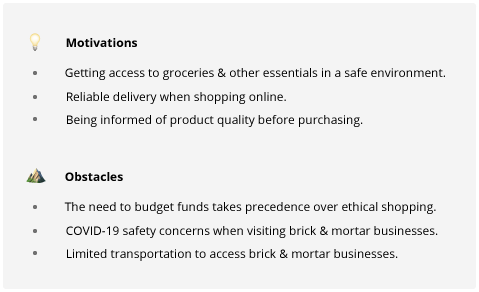
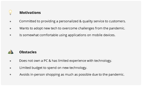
We crafted two personas, focusing on the motivations and obstacles that people may experience while shopping or managing a small business. These simplified personas helped us make quick product decisions.


Interaction Scenarios
With the three stakeholder personas created, we crafted interaction scenarios and a set of goals and tasks that each persona should be able to accomplish with our system. We did our best to ensure each of the scenarios demonstrated how users benefit from or are impacted by our design solution.
- Scenario 1: a user wants to purchase food locally via Backyard
- Scenario 2: a user wants to discover ethical business alternatives on Backyard
- Scenario 3: a business is setting up their Backyard account for the first time
Design
Storyboards
Sketching storyboards was the next step in the design process. I sketched the interaction scenarios as well as additional standalone scenarios to assist with the brainstorming process.

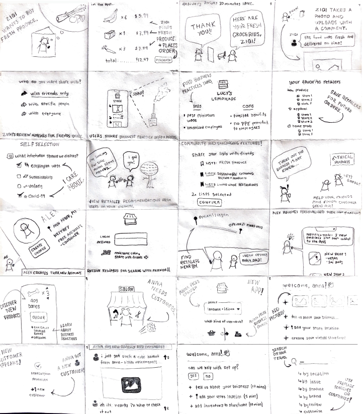
Creating the storyboards helped us with defining Backyard’s core product functionality:
- Enable consumers to access retailer information, including the location of brick & mortar shops and online inventory and services.
- Enable consumers to share their shopping experience with their friends, businesses, and the public.
- Provide a moderated information platform for responsible businesses to thrive.
- Offer an in-app checkout solution to streamline online shopping.
Paper Prototype
Creating paper prototypes was the next phase of the interaction design process. We pulled from our sketches and storyboards, as well as the core product functionality, to align on a basic site map and task flow.
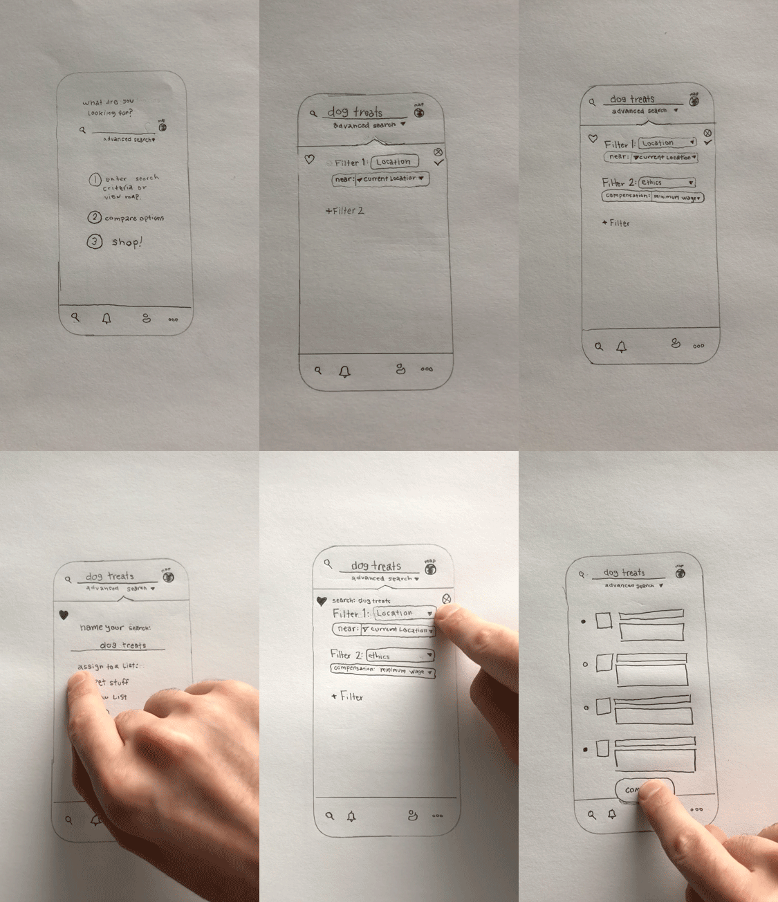
After building the paper prototype, the team conducted usability tests with the same stakeholders that we initially interviewed. Due to the pandemic, the paper prototype tests were conducted virtually over zoom which presented many challenges. This changed the nature of the test and, thus, the results, but it did yield some valuable insights that we applied to building our wireframes:
- Users were confused by what would happen if they interacted with the heart icon button. We decided to change the heart icon into a floppy-disk “save” icon to make its utility clearer.
- The “save filter to list” feature was intended to be optional, but some users thought it might be required in order to save the filter. We ultimately decided to remove this feature.
- One user was unclear with what to do with the “execute search” check mark button. The “cancel” button was also too close in proximity to the “execute search” button. We decided to make our targets larger and spaced out further in our v1 prototype design.
Wireframes
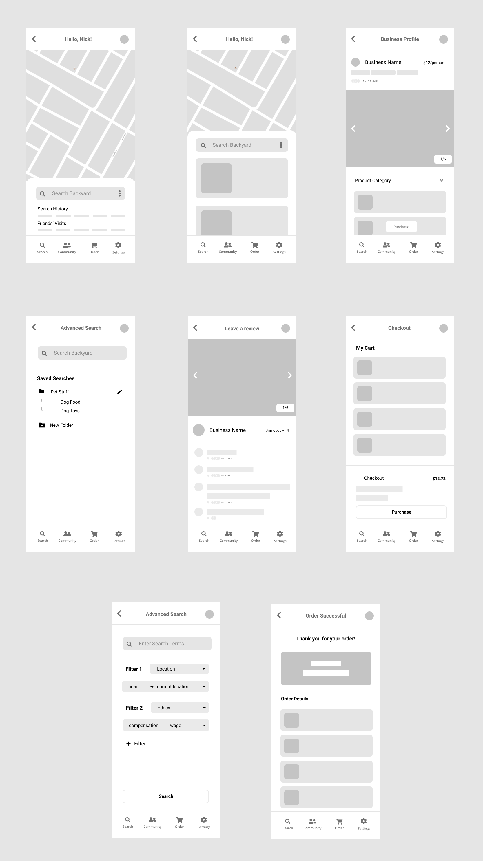
In a design review, we received feedback to narrow the scope of our design solution. We considered the “flexibility-usability tradeoff” which states that products that prioritize flexibility are often more difficult to use. We chose to focus on consumers over small business owners in order to limit our project scope. Additionally, we decided our most import features are the search functionality and purchase flow. We made these features have the most touch points in the wireframes as they drive the most value.
Visual Design
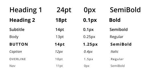
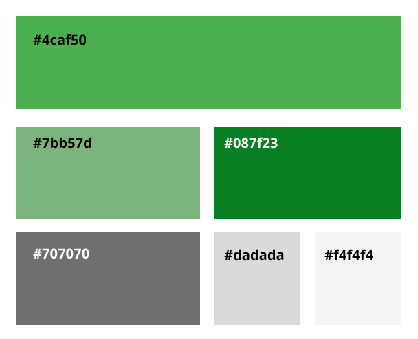
At this stage, our team focused on creating a style guide to align on visual components. We focused on typography, colors, buttons, cards, and shadows.
Inspiration
I pulled creative inspiration from a number of websites and applications. The inspiration board below served as a starting point for conversations with the team about individual design components. 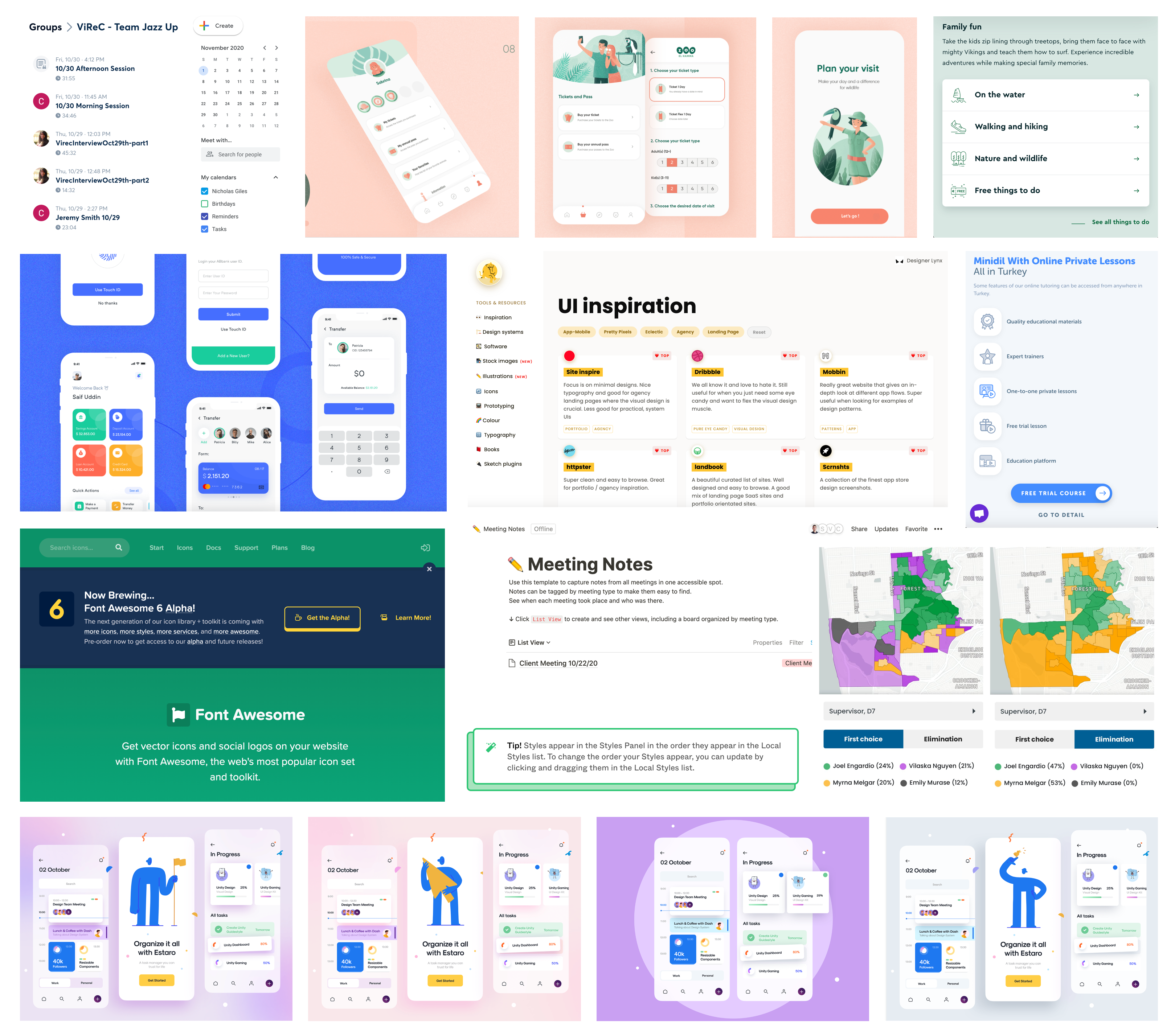
Typography
Colors
Buttons

Shadows

V1 High-Fidelity Prototype
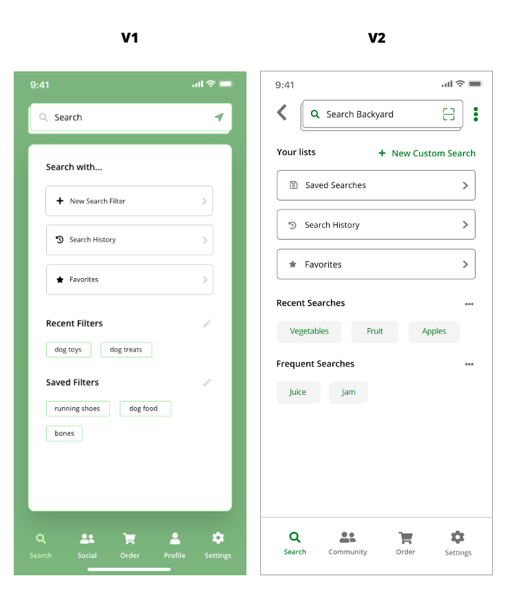
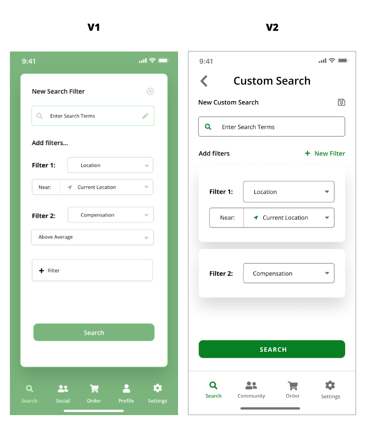
For our v1 high fidelity prototype, I focused on the advanced search features. During an in-class design review, we received the following feedback on our v1 prototype:
- Visual elements are inconsistent.
- Accessibility improvements are needed.
- Consider adding back button.
- Additional filters may be hidden from the users’ awareness if they never click the add filter button.
- It’s a little unclear where the saved filter setting are saved and if users can edit them.
Below you can see the changes that were made from the v1 prototype to the v2 prototype based on this feedback.
Additional usability testing would help us resolve the issues uncovered in our design review.
Final High-Fidelity Prototype
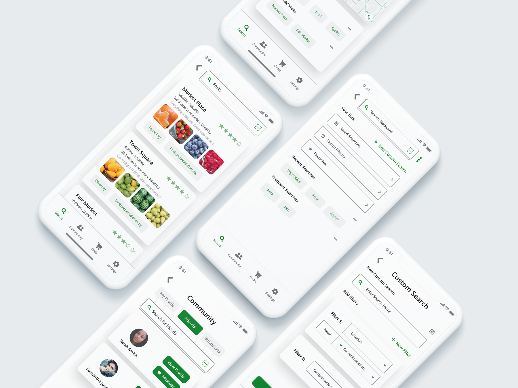
For the final prototype, we took insights from our usability tests to make a number of changes, focusing on improving the accessibility of our visual design:
- updated colors to ensure contrast ratio complied with WCAG and ADA requirements
- standardized font size, position, and style
- standardized spacing between elements using an 8x8px grid
Using a color contrast assessment tool, we tested the color contrast of white text on the green background and realized that the contrast between our initial green color and white was not sufficient in order to satisfy Web Content Accessibility Guidelines (WCAG) and American Disabilities Act (ADA) requirements. We adjusted our colors accordingly to ensure we comply with these important guidelines and accessibility laws in the U.S.
Below you can find the final product slides we presented on the last day of class:

Reflection
There are many aspects of this project that could be improved, but, overall, working on this project was a great learning experience and an introduction to interaction design. I believe creating a site map would have helped our group get more aligned on solutions prior to designing our wireframes. Additionally, Covid-19 made in-person usability tests much more difficult to conduct.
The implementation of the advanced search and filter features could be greatly improved as well. If we had additional time to iterate on the prototype, I would relocate the advance search features to be directly on the home search screen, as these features are core to the experience of the product. Additionally, the material impact that this information system could have on people’s lives is unmeasured and would need to be studied and defined. Additional research would be required to determine second and third order effects on impacted communities.
